

Overview
Worked in a team of self-run student marketers, developers, and product managers to deliver research findings and mock-ups for an iOS application released on the App store.
Role
Product Designer
Duration
September 2018 — December 2018
01. Background
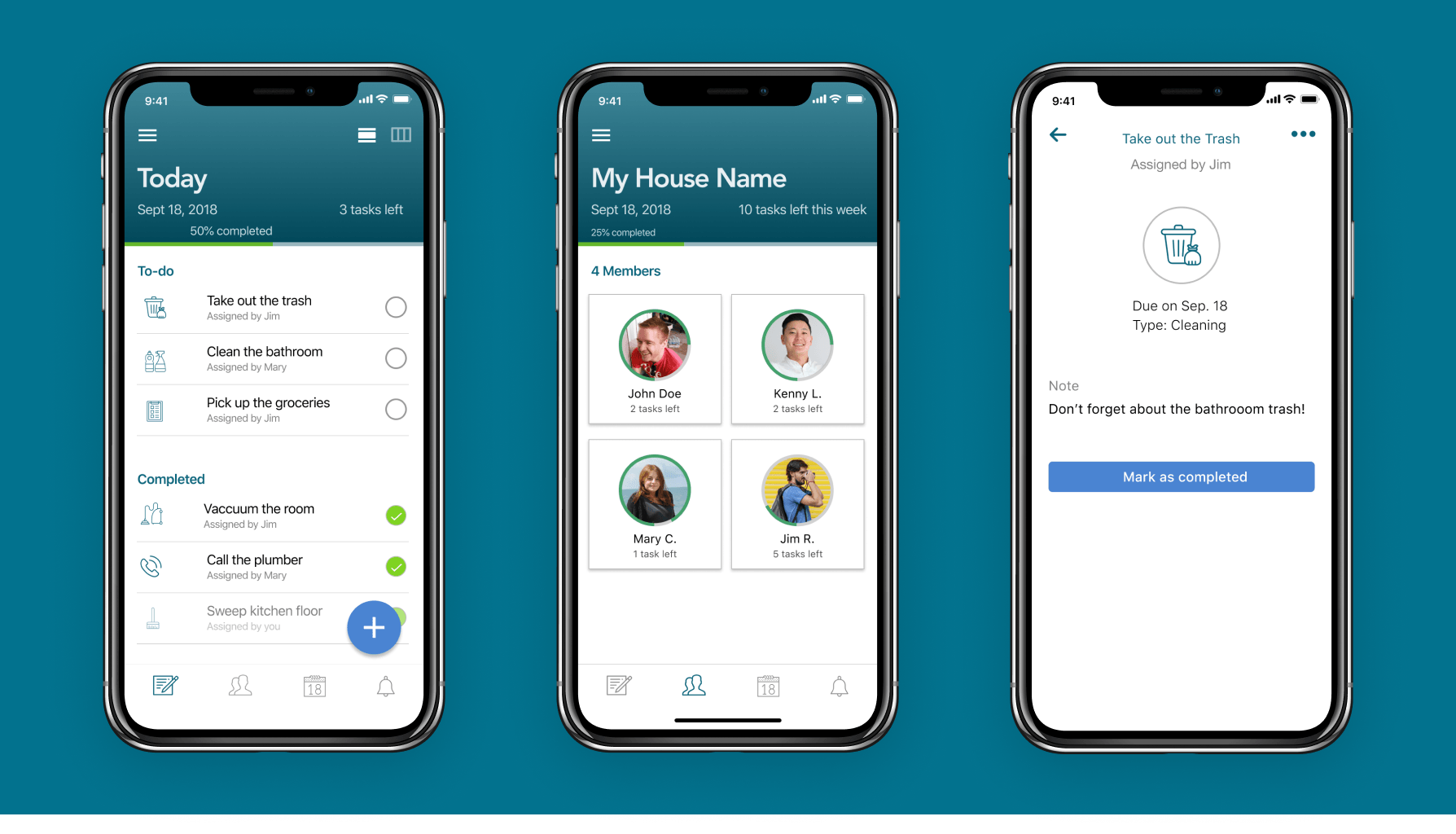
Chor is a mobile application that delegates, manages, and aids in the completion of common household tasks. Users can create, assign, and complete chores for a household, keep track of what chores they need to complete throughout the month and get a quick idea of what the rest of the house is responsible for.
You can check out our Instagram here.
02. Problem
If you've even been a home occupied by college students, chances are you've noticed they're pretty dirty. Scattered solo cups, old dishes in the sink and strangely sticky floors are common encounters when hanging out in shared college living rooms.

So why do smart, typically capable people let their homes get to this point? We hypothesized that housemates have trouble communicating their expectations about home cleanliness and chore division.
03. Research
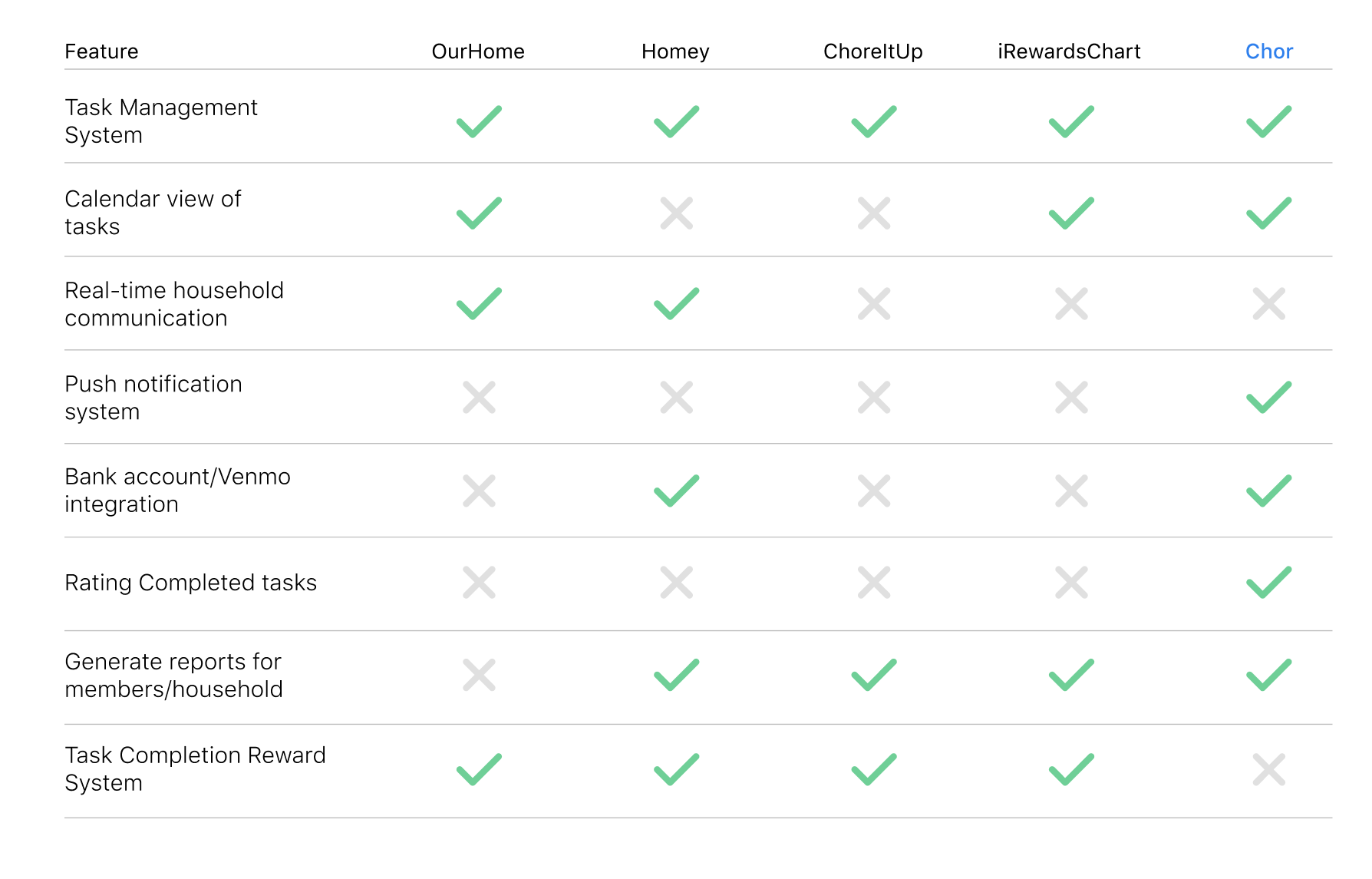
Analyzing the domain space situated our application within the competitive space. Some key takeaways:
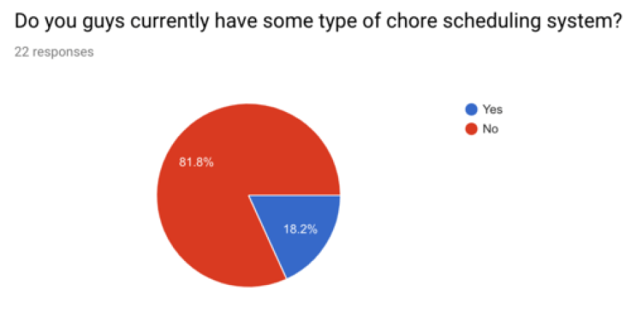
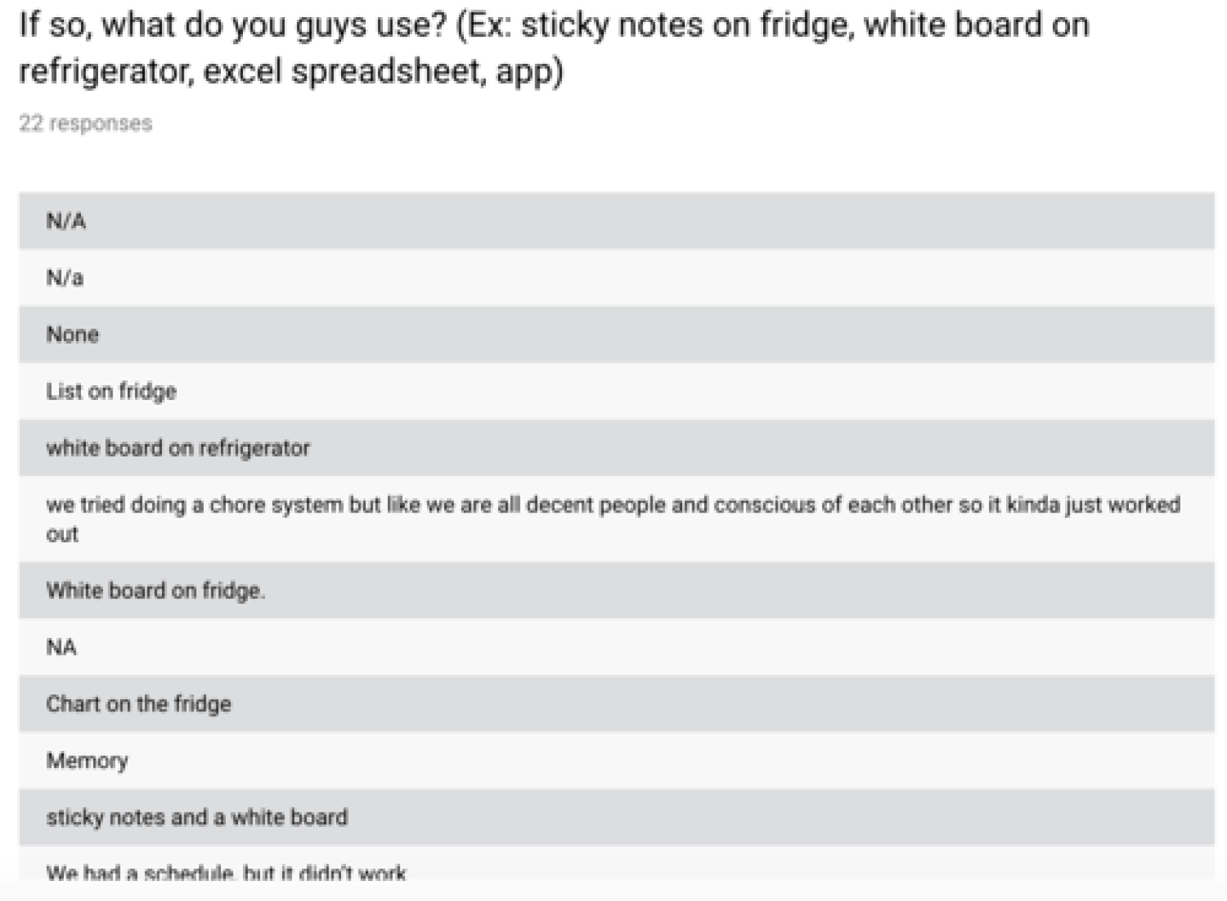
In a survey of 22 undergraduate college students, 81.8% of respondents used some sort of chore scheduling system (such as whiteboard systems, Google calendars, post-its). 70% of respondents reported that the most common problems in the household were lack of communication or cleanliness. Traditional household methods don't work for some reason or another.
I conducted six structured interviews with college students to understand what their current living and chore situation was like.
Notable quotes:
“Keeping shared spaces clean and having people stay accountable for their messes is the hardest part.”
“Dividing up how much work we all put into the house is a pain and doesn't work. Once one person slacks off, the rest of the house does.”
“I wish they wouldn't get mad at me when I tell them to clean up or turn things off when they're not being used.”
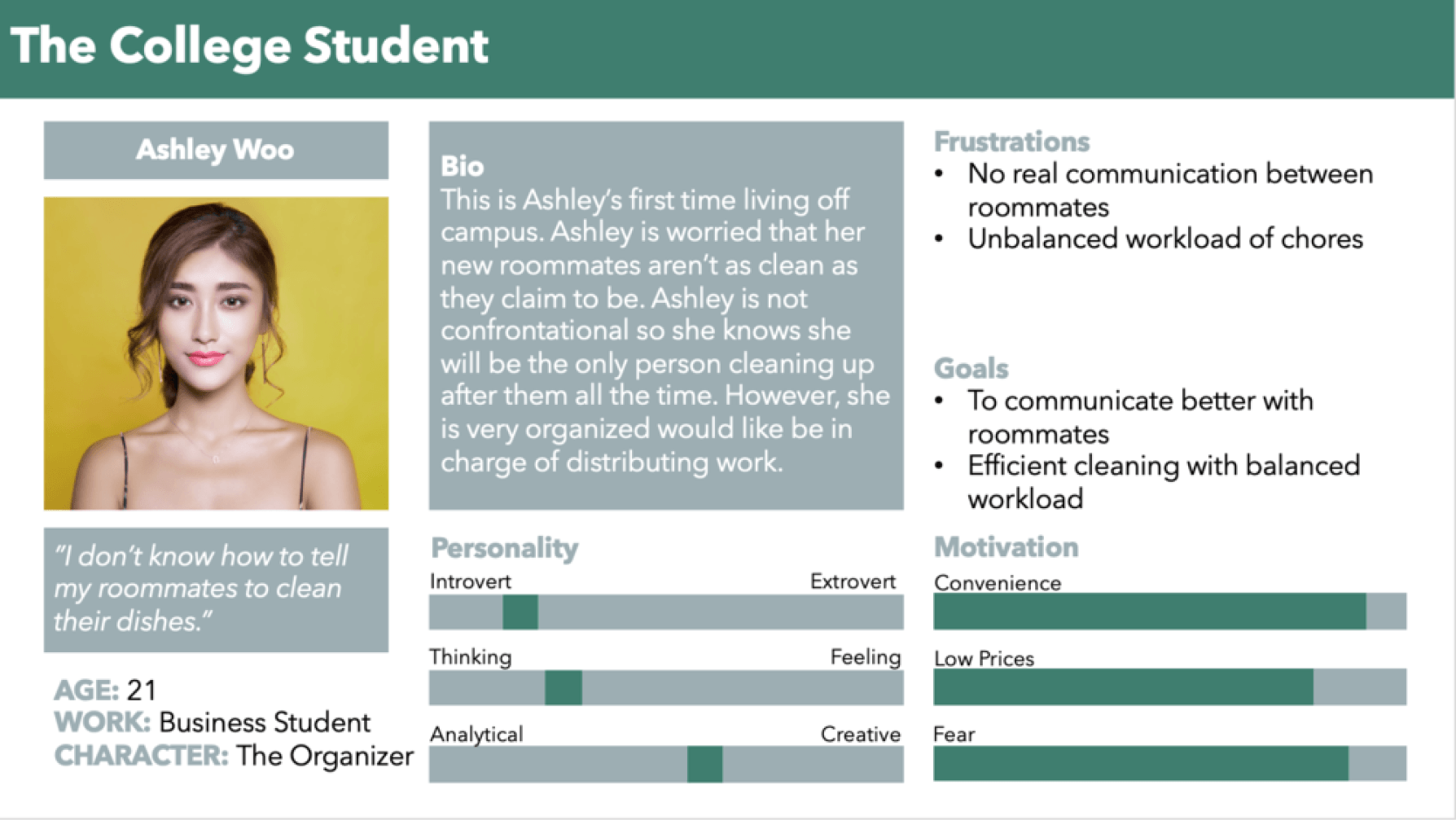
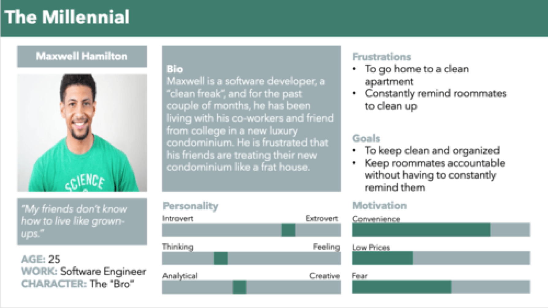
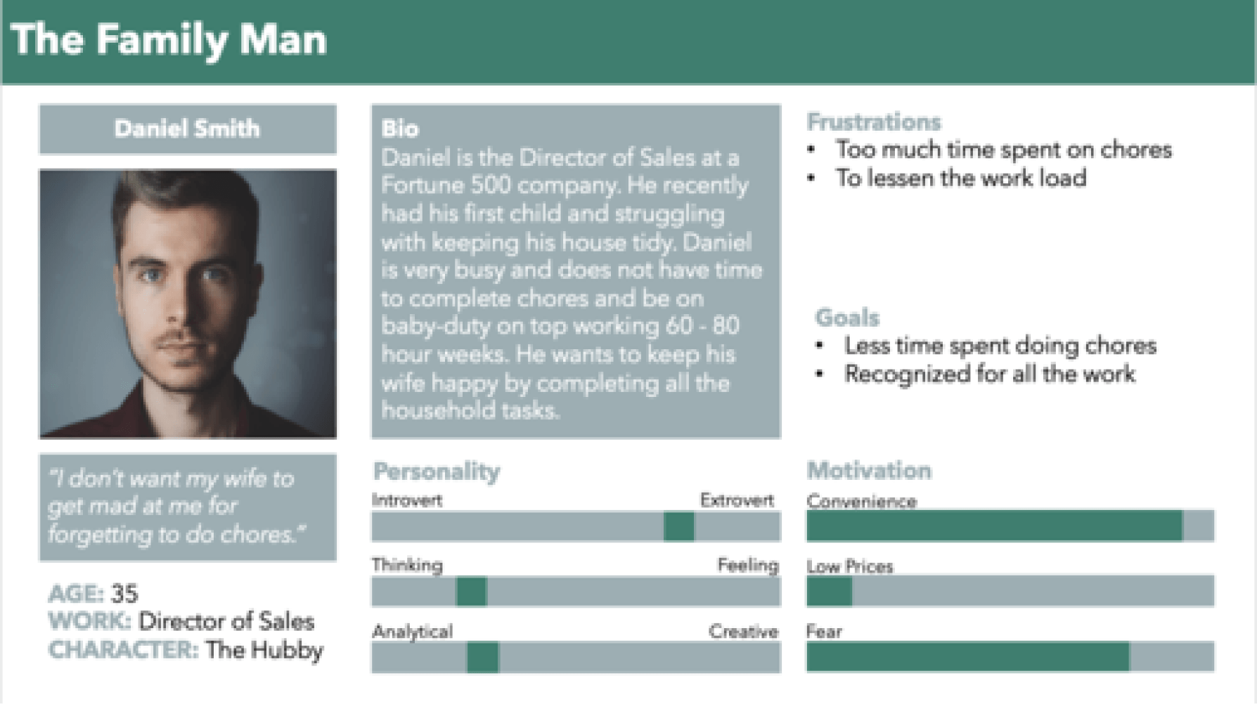
After taking note of major pain-points, goals, and similarities between interviews and survey responses, two personas were developed: the primary persona of the "college student" and the secondary persona of the "millennial". We kept the "family man" persona in mind as well but ultimately decided to focus on college-aged (18 – 27) students who are likely to have similar aged roommates.
04. Solutions
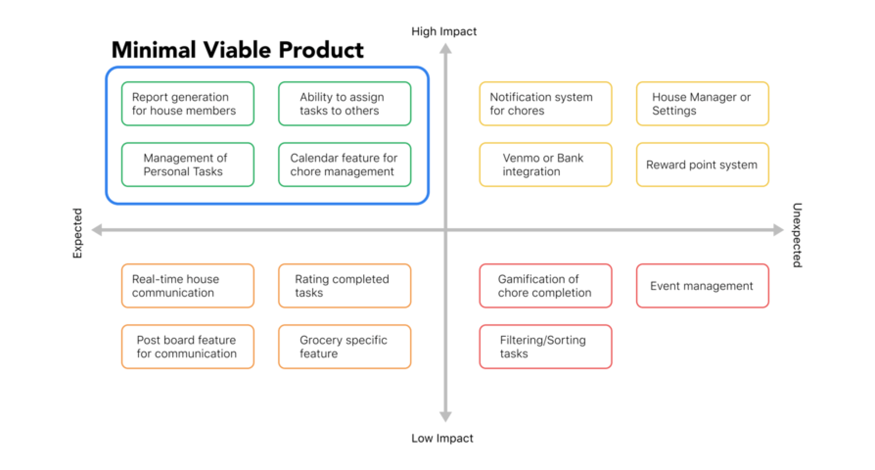
Keeping our personas in mind, we brainstormed potential solutions to problems brought up in user interviews. Focusing on the goals of keeping housemates accountable to one another and limiting potential awkward conversations between housemates (e.g. "Are those your dishes?"), we ranked each feature on a high impact and high user expectancy chart, focusing on quadrant I features.
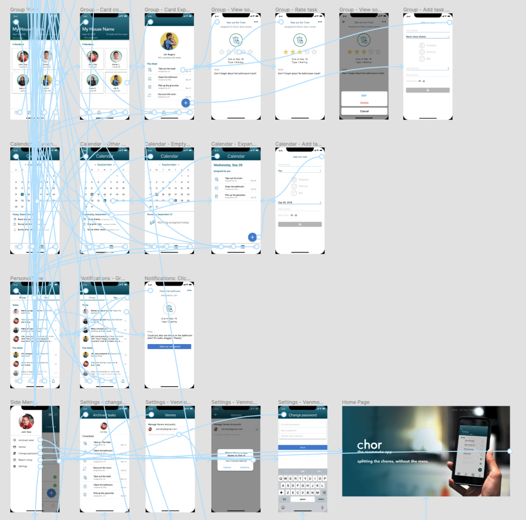
I then went through the process of sketching out user flows, information architecture, and wireframes on paper before prototyping in low-fidelity in Figma.
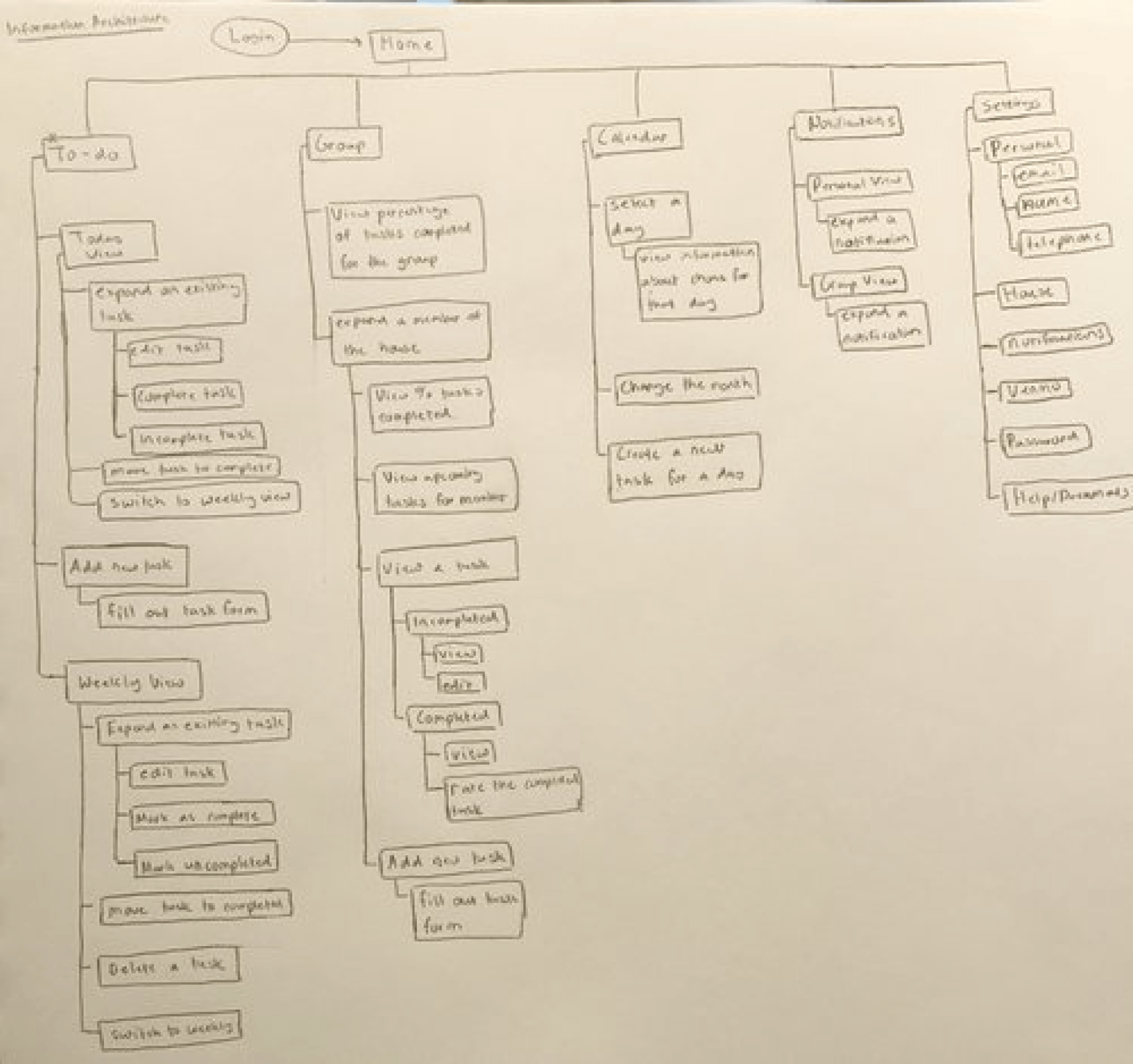
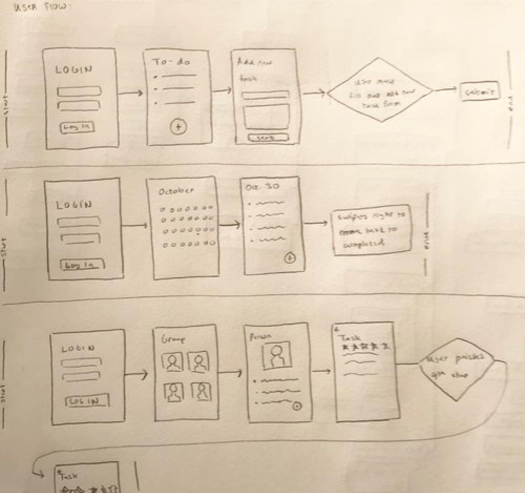
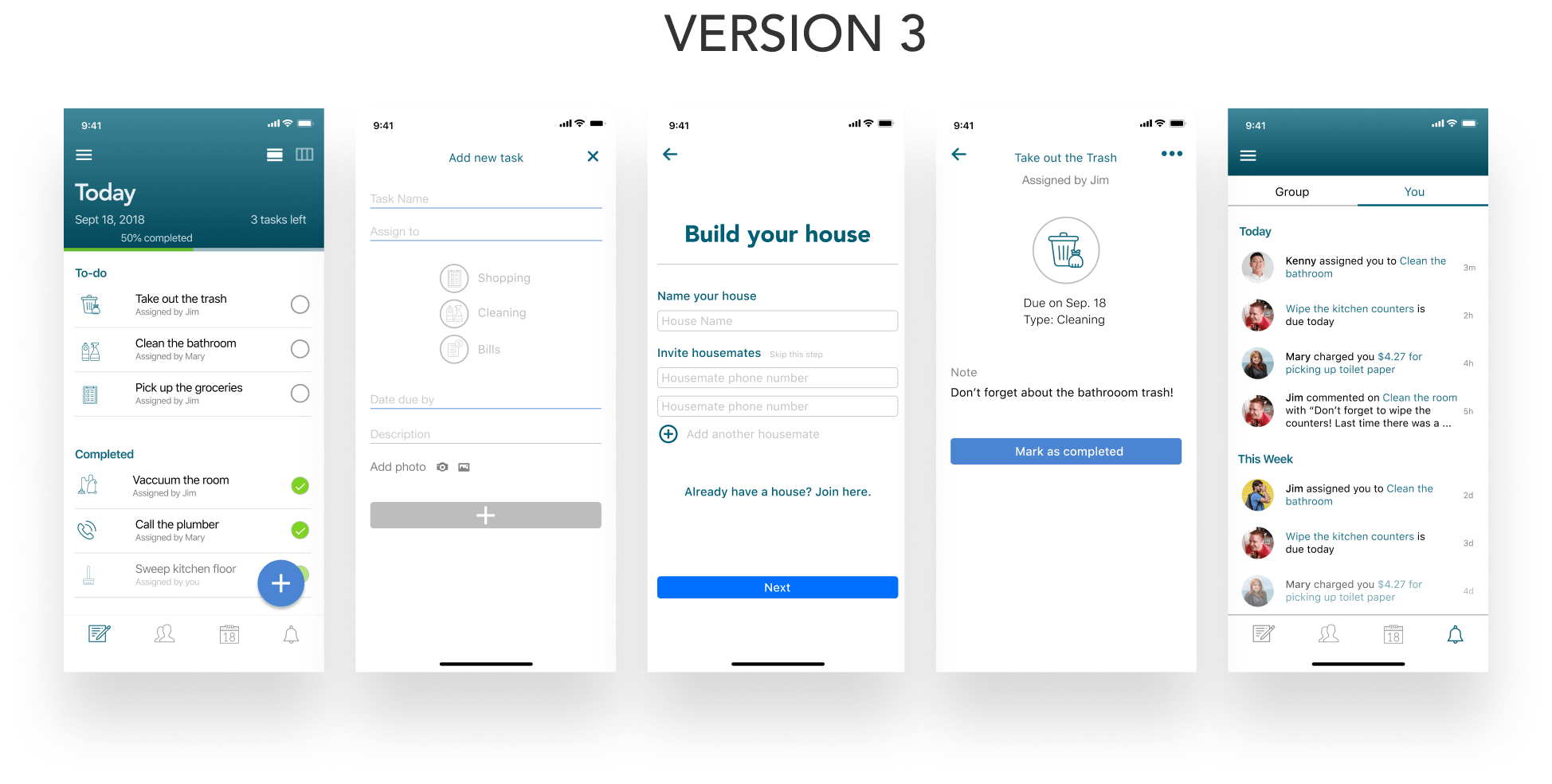
I consolidated planning and sketching work into the Chor prototype, a mobile application that delegates, manages, and aids in the completion of common household tasks.
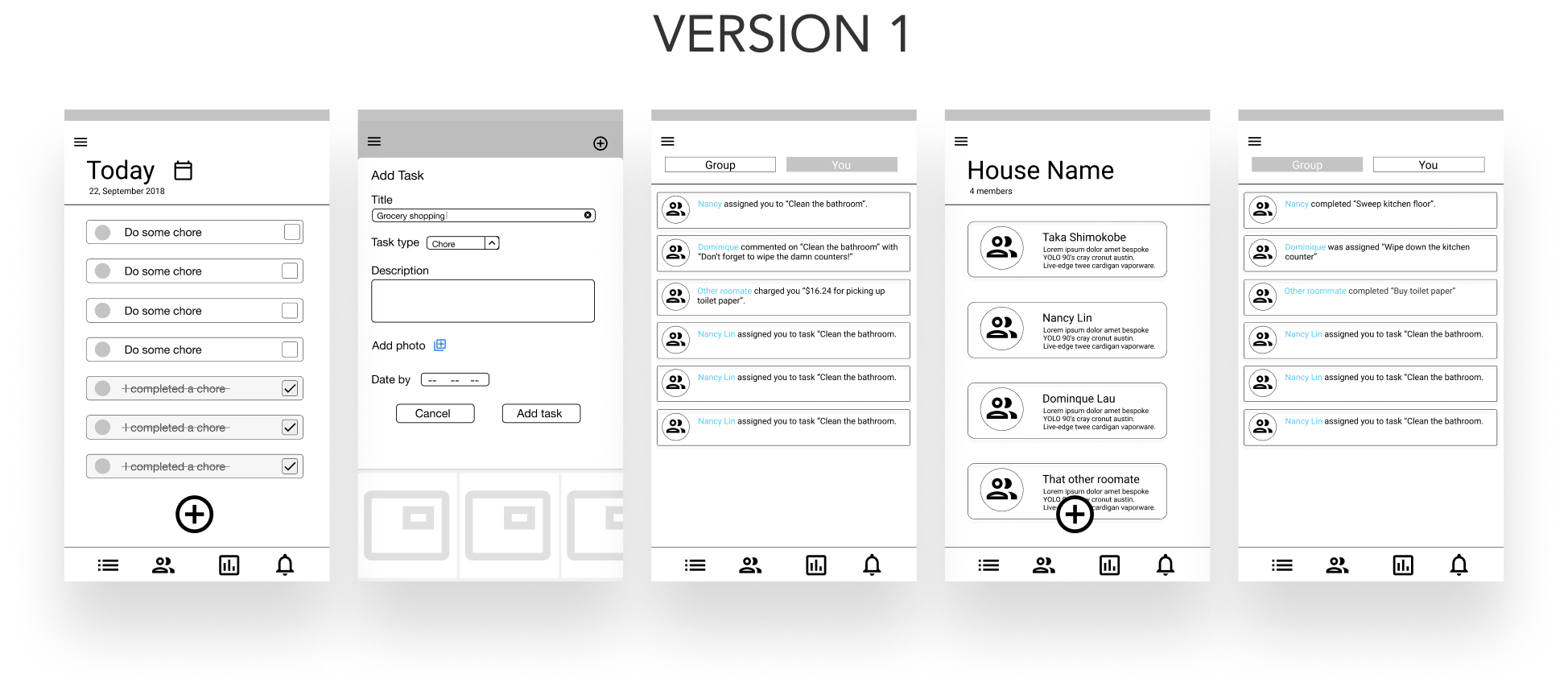
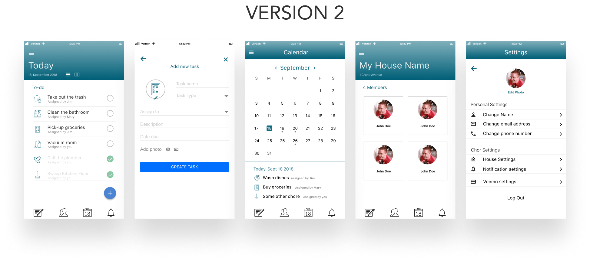
Final Design Features
I tested the user tasks of creating a household, creating and assigning a chore, and completing a chore through 4 think-aloud click tests. User testing revealed that the number of tasks initially shown to the user seemed overwhelming and to rethink the placement of task type when creating new tasks.
After two rounds of iterating, testing, and working with developers for design handoff, the final iteration was developed and released on the iOS app store.
05. Reflection
Although our team had the ultimate goal of becoming a funded start-up, we ended up burning out and was unable to maintain Chor post-release onto the app store. Nonetheless, this was a great learning experience.