Loading parrot. Har Har.

Xplore

Xplore banner

Overview

Xplore (previously known as PolyXpress) is an application focused around location based storytelling and story creation. As the product designer on this project, I overhauled the existing experience and interface design to be more accessible, usable, and aesthetic.

Role

Product Designer

Duration

March 2018 — June 2018

01. Background

Xplore is a web-based application for location-based story telling.

The application takes you on a physical journey as you go through real-world locations. You interact with both physical and digital environments through your mobile device as a multimedia story unfolds. My team was charged with reimagining the app's functionality and interface design.

As the main designer on this project, my role was to redesign the application to be more accessible to the general user. I provided research reports, wireframes, and prototypes, as well as an exploration on integrating augmented reality to accentuate the viewer experience.

02. Problem

The interface is outdated and has poor user experience

The previous interface of Xplore, previously known as PolyXpress.
JupyterLab in a “console” context, using the programming language Python.

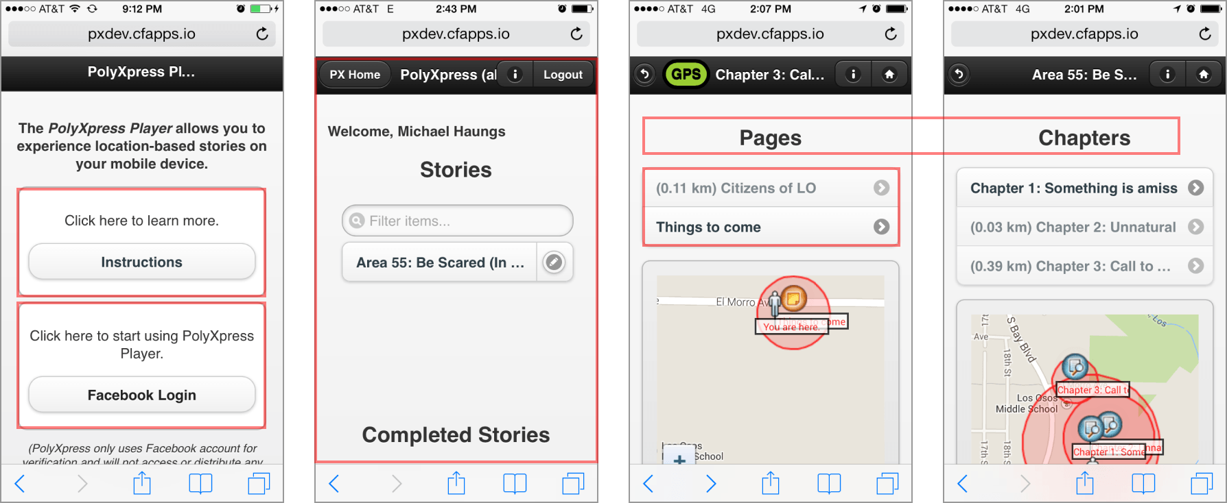
Our team conducted a heurestic analysis on Xplore after consulting with our primary stakeholder. We found that the current design had several problems:

  1. A steep learning curve. There are little visual cues to indicate call-to-actions. On the home screen, there's a link to an online user-manual. This indicates poor usability for a consumer-facing application.
  2. The interface is not aesthetic. There is little visual design work, hindering perceptions of usability.
  3. Information hiearchy of interface elements is unclear.
  4. Limited functionality. Users are limited to only text-based stories without rich media (photos, sound, etc.).

03. Research

Studying AR and Environment Design

As my first foray in designing for AR, I read into educational resources about the topic. This Medium article by Tyler Wilson was particularly helpful.

Our team referenced applications such as Pokemon Go, WonderScope, and Enter the Room to develop an understanding on how AR applications handle navigating transreality, interactions with virtual environments, geocaching, and linear or non-linear storytelling.

Storyboarding Rough Concepts

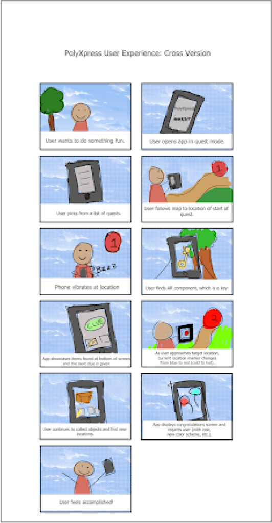
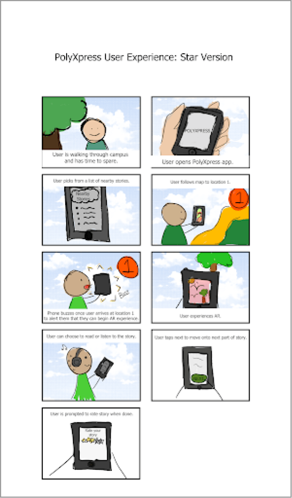
We decided to overhaul the system model of the original design. After brainstorming and testing different storyboard concepts with 6 users, we came up with two different directions to take Xplore:

  1. Follow Along Method. User discovers points of interests, and "follows along" instructions from app.
  2. Quest Method. User discovers "quests", and navigates place to place to complete portions of the quest.
The final two storyboards.

Interviewing, Affinity Mapping, and Persona Development

Interviews with 6 users of AR apps gave us an understanding of where to take the direction of PolyXpress and what previous experiences with AR apps were like.

  • Users preferred the quest based interaction model.
  • Augmented reality apps can seem "gimmicky" depending on what use case they were trying to meet.

After transcribing interviews by writing down notes on post-its, we clustered similar post-it notes, forming groups such as interface design, environments, pain-points, story direction, and goals for design.

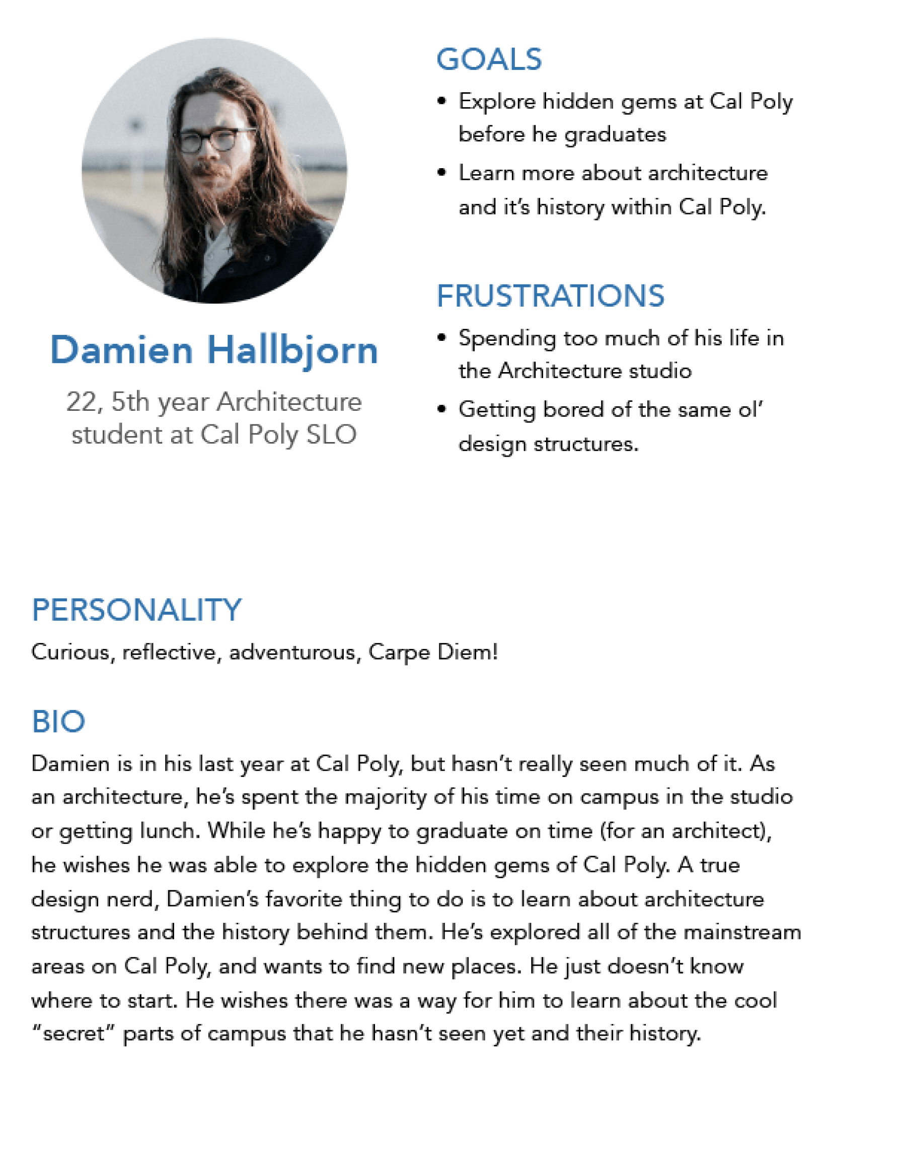
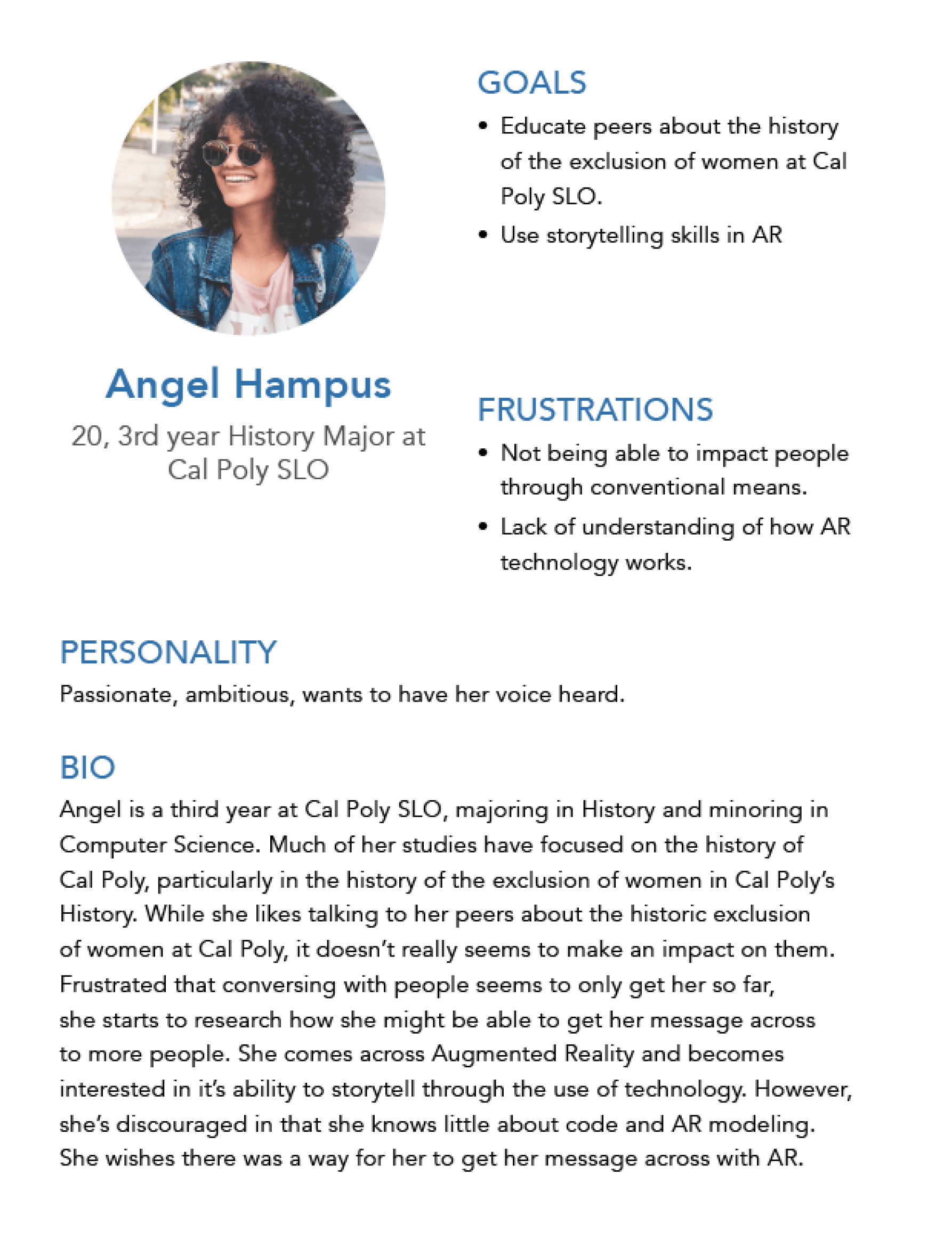
Based on our affinity map, two personas were created: 1) the viewer persona 2) the story creator persona.

Our primary personas based on our interviews and affinity map.

04. Solutions

Planning Out Design

After brainstorming potential solutions to user pain-points and motivations, features were mapped out onto a user impact and user expectancy scale. Features in quadrant I were given high priority for first rounds of designs. Initial prioritized features:

  • Geocaching. Navigating to and finding stories based on geographic location
  • Story Creation. Providing creators options to make stories with AR objects, sound, pictures, and other rich media.
  • Notifications. For viewers, notifications would enable discovery of stories. For creators, they give them up to date information on the status of their stories.
  • Rating and reporting system. Necessary for safety reasons and authenticating stories.

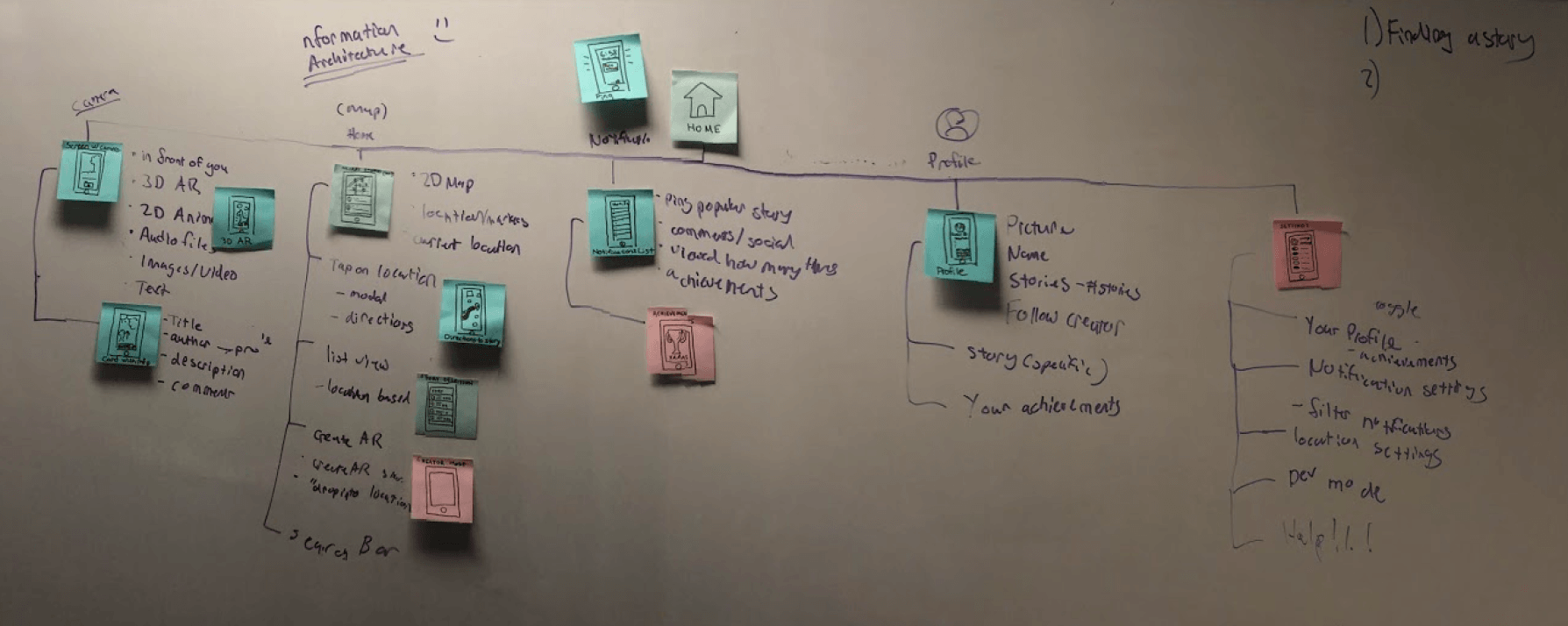
For each feature, we gave each of them a classification scheme, ranked them, and formed the information architecture blueprint of Xplore.

Information architecture of Xplore on a whiteboard
Mapping out the information architecture on the whiteboard.

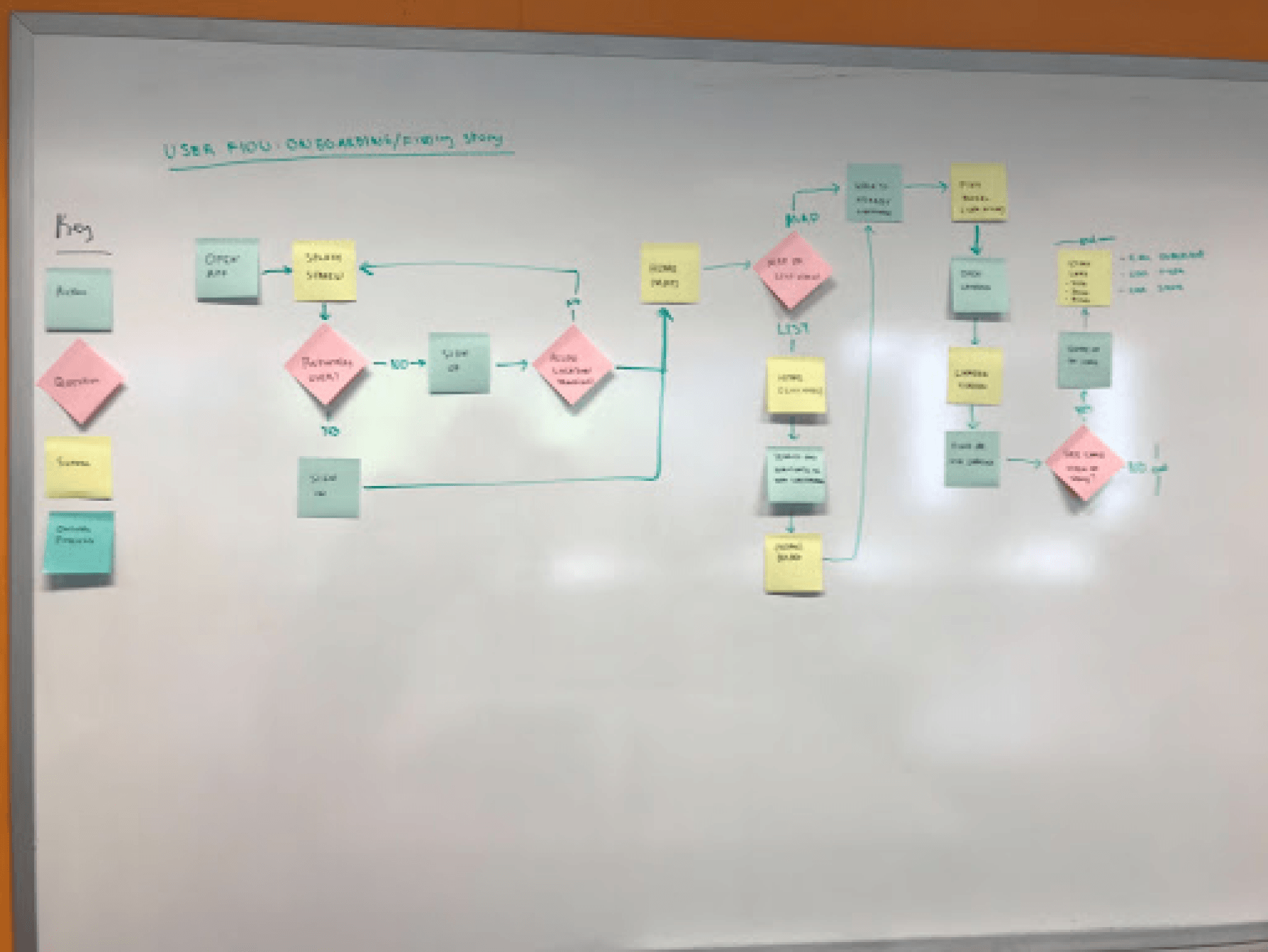
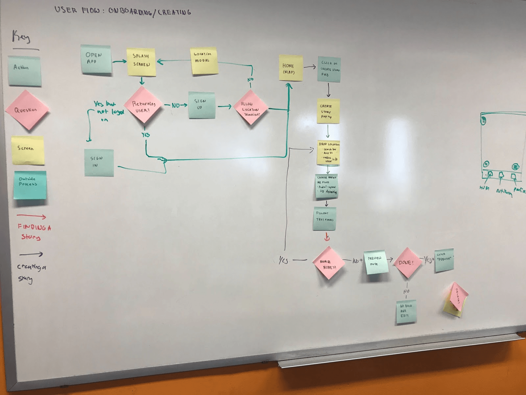
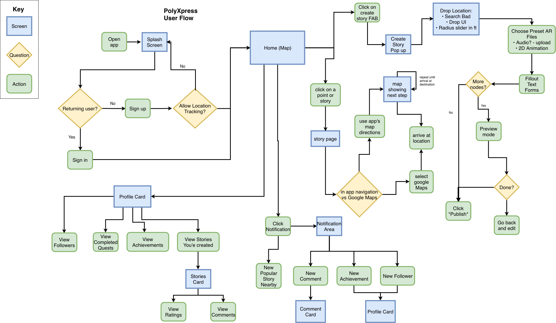
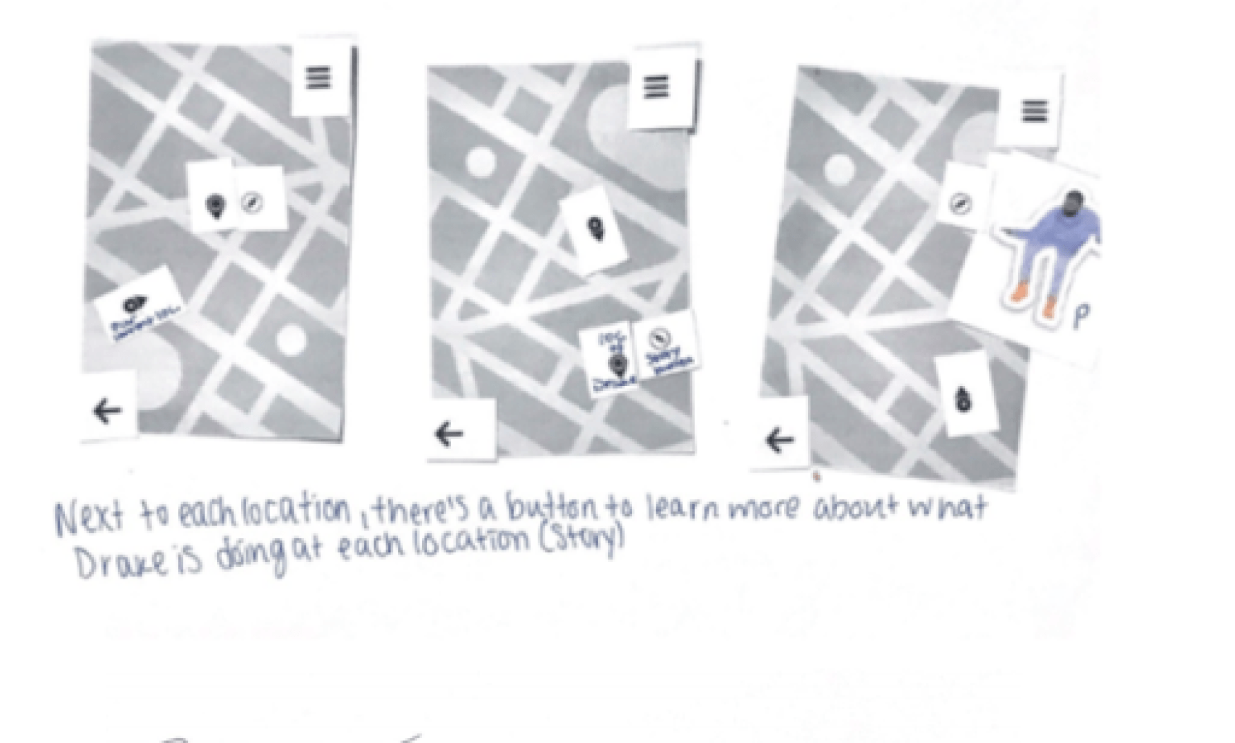
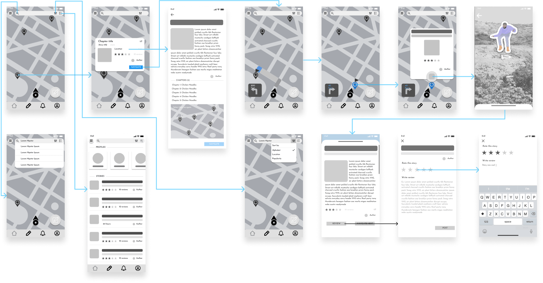
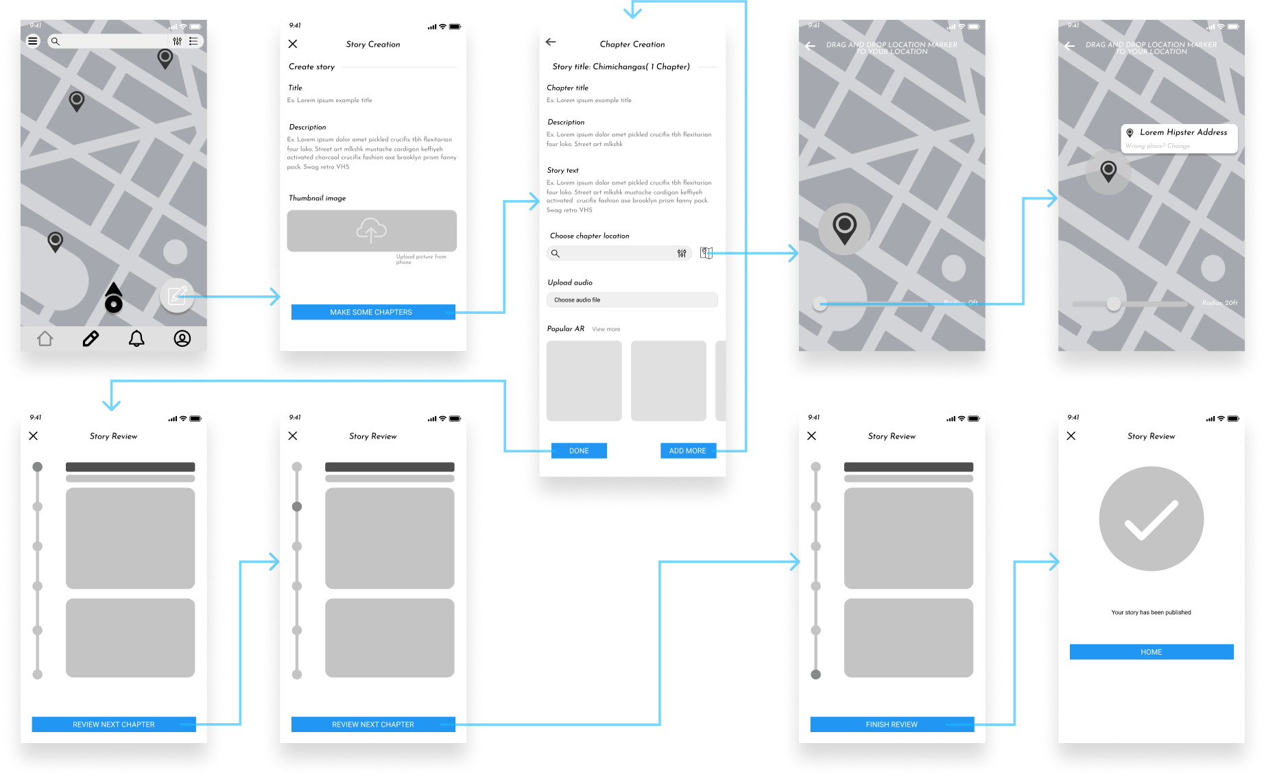
I then mapped out user flows, beginning by using post-it notes then translating digitally for the main tasks of creating an account, onboarding, navigating to a story, finding a story, and creating a story.

JupyterLab in a “console” context, using the programming language Python.
Iterating on user flows, going from post-it notes on the whiteboard to mapping flows out digitally.

Participatory Design Workshop

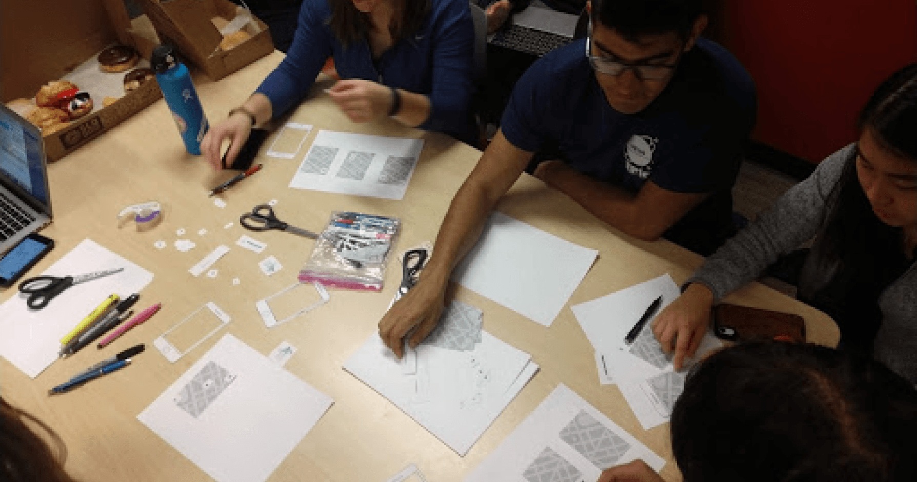
We held a participatory design workshop with 5 participants over a 40 minute time period. The workshop had two activities:

  1. T/F Scenarios. Participants were given 8 scenarios to either agree or disagree with, and provide notes on.
  2. Paper Prototyping. Participants were asked to create a mock-up of a scenario using pre-printed and cut-out components.
JupyterLab in a “console” context, using the programming language Python.
Photos from the workshop, including true/false scenarios and paper prototyping.

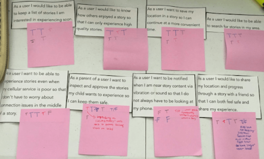
Key Findings from Workshop

  • Social features should be limited to rating stories and following creators.
  • Rather than a linear path for story-telling, a non-sequential path where the user can "retrace their steps" as they navigate through a story.
  • Visual cues for directions to stories are important for users.
  • There are security and safety concerns with the app. Who is able to create a story, and can any type of story be created? Can anyone have an account?

Prototyping, Testing, and Iterations

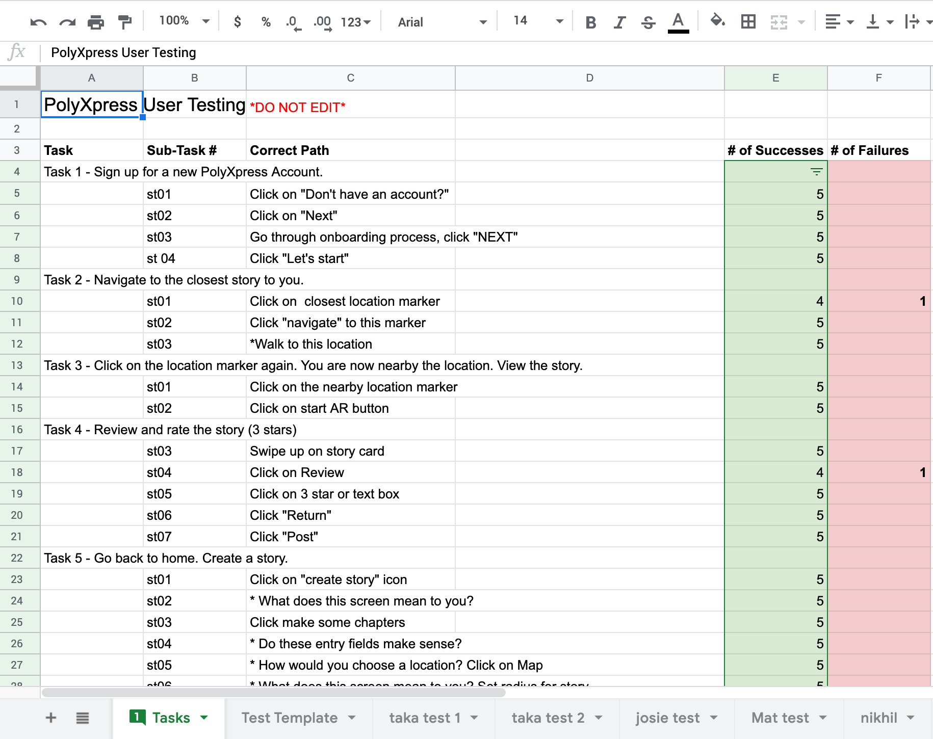
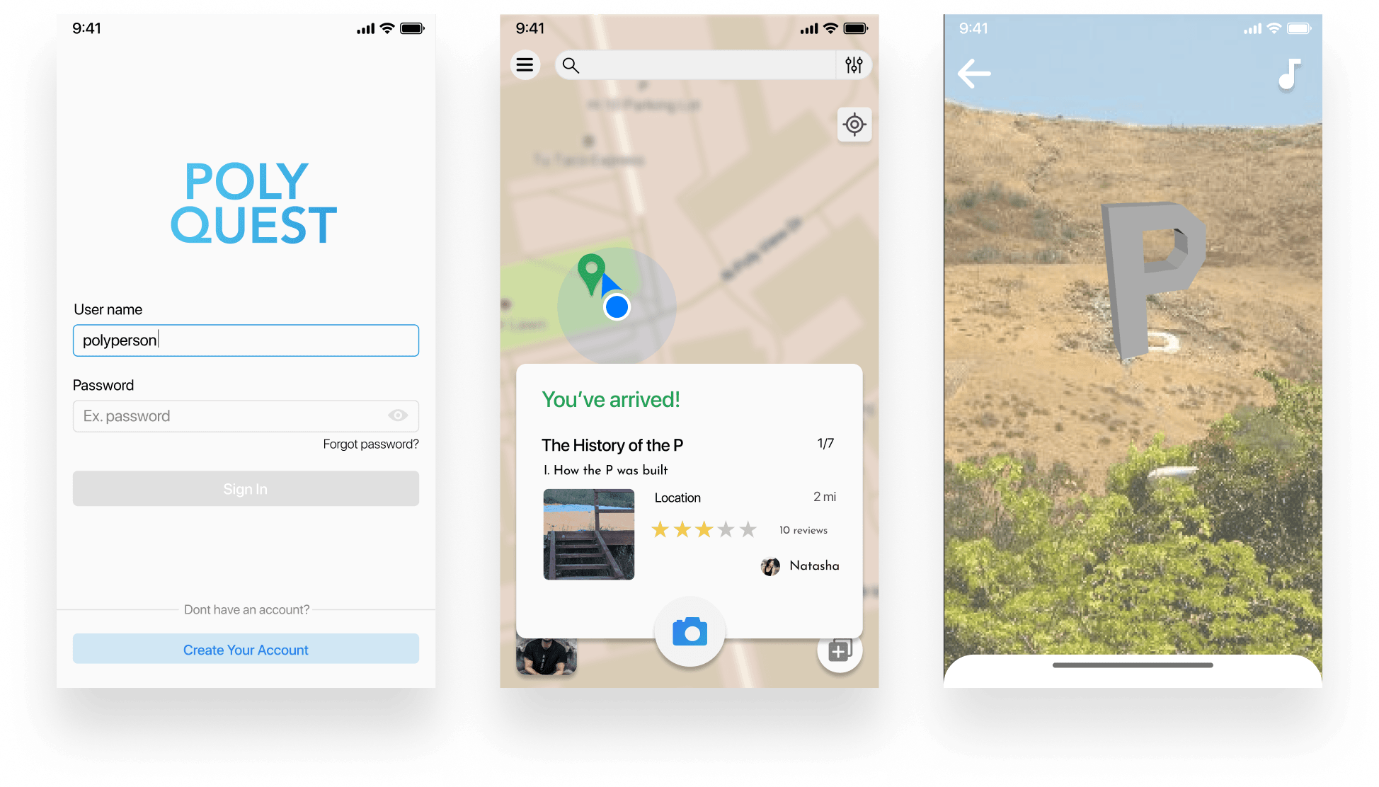
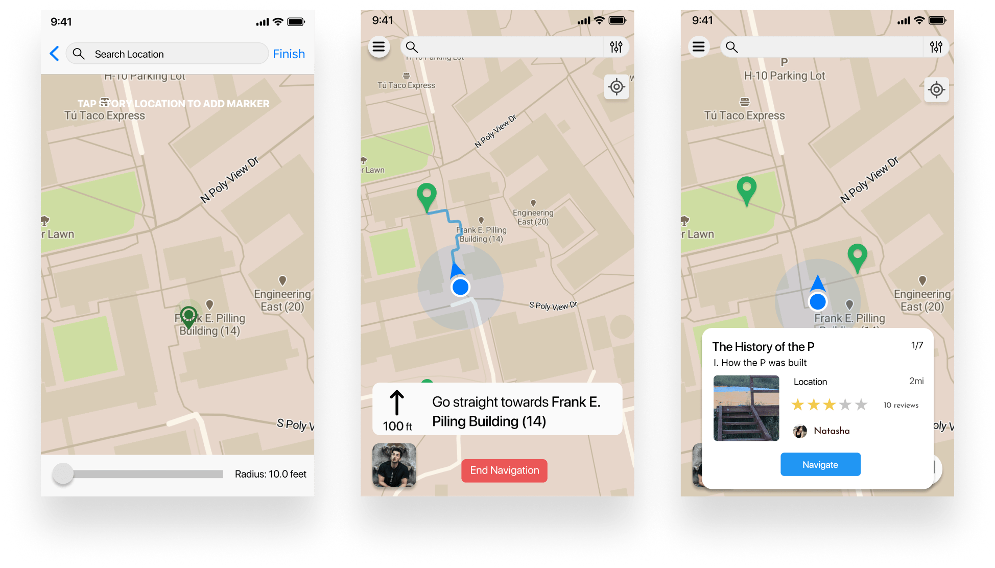
Beginning with low-fidelity prototypes, I translated the user flow map to Figma frames. After creating the low-fidelity prototype, I wrote a user testing script and our team conducted 6 users tests for the following tasks: 1) Sign up for a new Account, 2) Navigate to the closest story to you, 3) View the story, 4) Give the story a 3 star rating, 5) Create a story.

JupyterLab in a “console” context, using the programming language Python. JupyterLab in a “console” context, using the programming language Python.
Low-fidelity wireframes of the first round of iteration.

For user tests, we measured two metrics: time to completion and success rate. With 6 participants, we had a 97.2% success rate for completion of tasks out of 8 tasks with 54 subtasks (happy path).

User Testing results measuring time to completion and success rate.

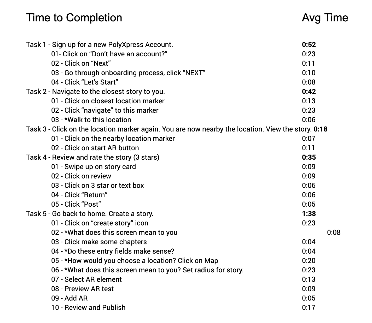
Some areas of improvement that were commented on:

  1. Visual Design. Although this was a low-fidelity prototype, participants expressed that several components (like buttons) could be made more colorful and larger.
  2. Reviewing Chapters. Having to give a rating to each "chapter" in a "story" seemed like overkill. Might benefit to having users go through the whole story, then review it rather than each individual chapter.
  3. Creating a Story. Should explore different ways to choose a location to create a story. Users were confused on dragging and dropping locations.
JupyterLab in a “console” context, using the programming language Python. JupyterLab in a “console” context, using the programming language Python.
Mid-fidelity screens from the second round of prototyping.

After two rounds of iterating at varying levels of fidelity, we reached saturation on user testing results. I went into Framer to create the final prototype – working on micro-interactions / animations, and prototyping sound.

Prototyping the final iteration in Framer. Shown here are the onboarding, finding and navigating to a story, viewing a story, and creating a story flows.

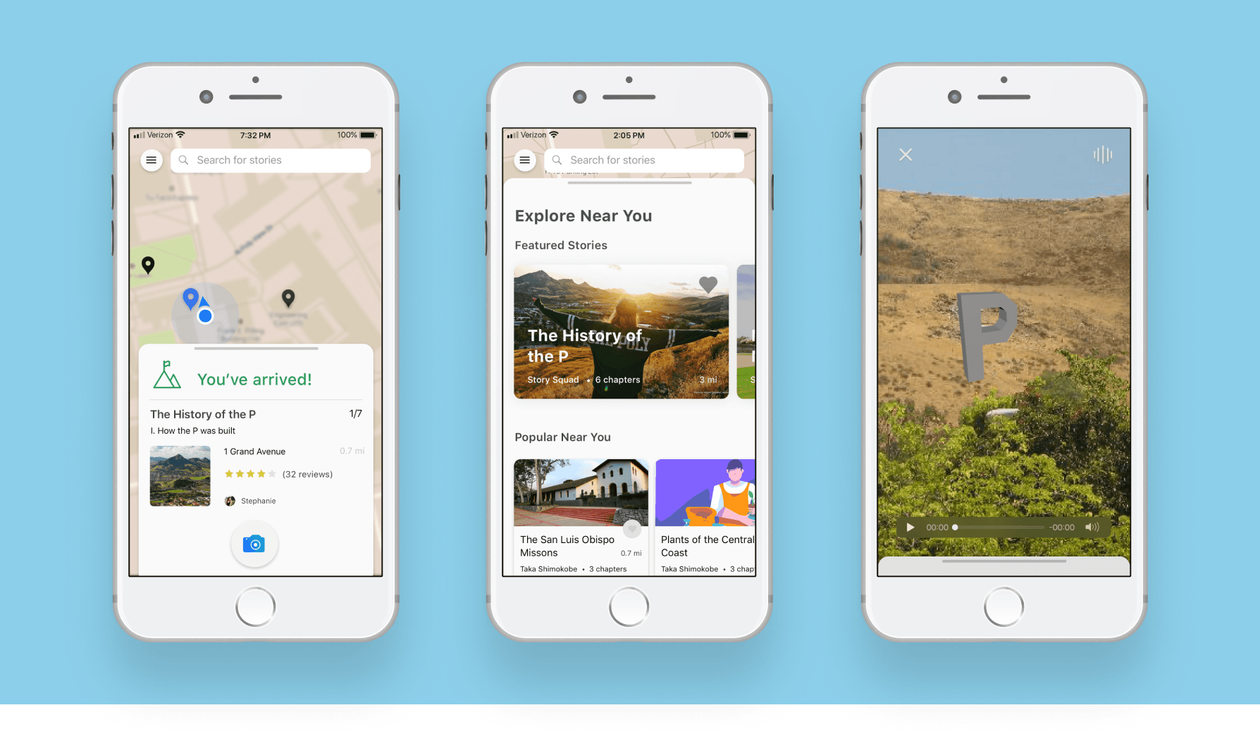
Final Design Solutions

  • Stories and Chapters. Each "quest" is a story, containing multiple chapters at different locations. Chapters can be experienced non-sequentially, or saved for later viewing.
  • Map and List View. To discover stories, users can click on location markers (indicating stories) nearby them on the map, or by searching nearby stories in using the search bar. After choosing a chapter from the story, the Map interface navigates the user to that chapter.
  • Viewing Stories. When nearby a location marker, the navigation card changes to prompt the user to open up their camera. Users then use the camera to view AR objects, text, or sound, designed by the creator. After completing a story, users can rate & review the story as a whole.
  • Creating Stories. Story creation is broken up into different sections (each section is a different type of rich media). For AR objects, users have access to a "bank" of premade AR objects made in Unity.

05. Reflection

Takeaways from the Project

After completion of the FramerX prototype, designs were handed off to primary stakeholders. There was a noted improvement in the user interface design and interaction model of PolyXpress.

This was a huge project that I spent quite a bit of time on. It was a great experience getting to prototype the end to end flow of three versions of Xplore at different levels of fidelity. Some takeaways:

  1. User customization of AR objects is a complex and difficult problem to solve.
  2. With more time, I would have focused more heavily on prototyping AR objects in higher-fidelity.
← Dashboards Chor