
Overview
During my internship at Project Jupyter, I designed a dashboarding platform that leverages JupyterLab's rich environment for data visualization and exploration. Design work was shared among engineering teams working on initiatives surrounding dashboards.
Role
User Experience Design Intern
Duration
March 2019 — June 2019
01. Background
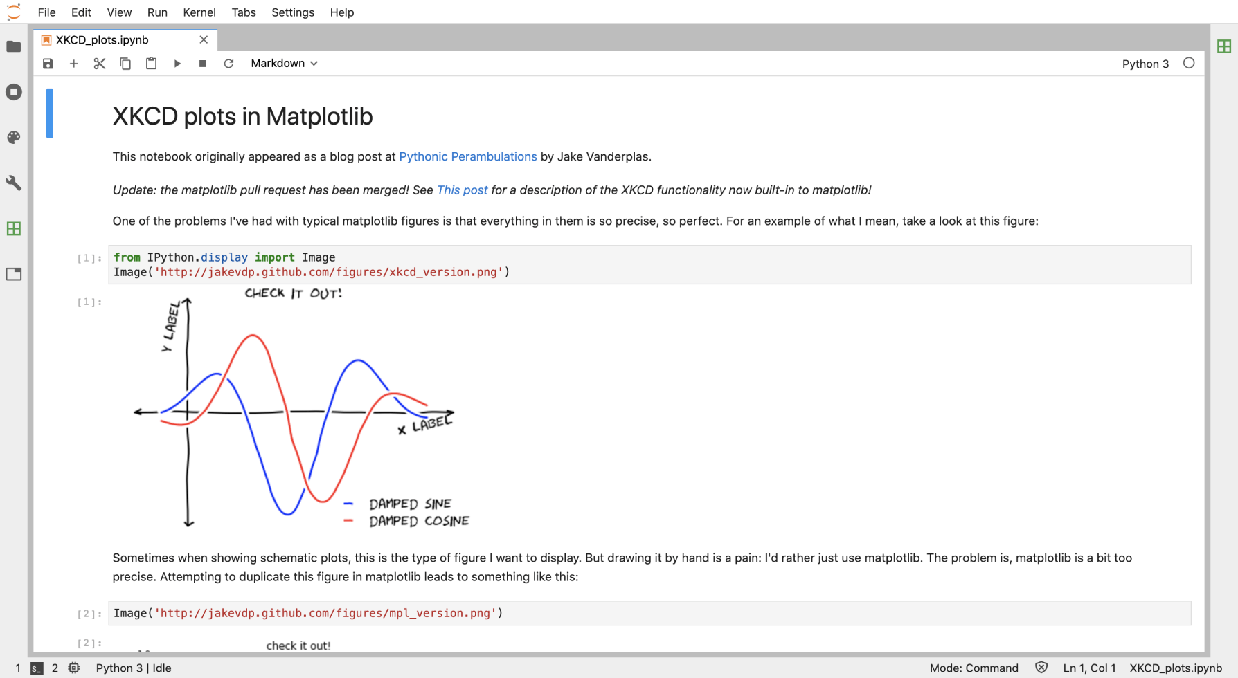
JupyterLab is Project Jupyter's flagship integrated development environment where users can write, run, and present code in the same interface. JupyterLab is an environment for producing rich output, including 3D images and data visualizations. JupyterLab is great for producing and presenting data work in a linear, notebook-like format. JupyterLab is not great for presenting data work in a grid-like layout that summarizes main-points.
Unlike notebooks, Dashboards offer a single point of access for disparate data. Instead of going through various sources of data, a viewer only needs to scan the dashboard to get an overview of important points. Dashboards provide easier, faster, and more comprehensible data by taking the best of several worlds (markup, code, and visualizations) and placing them in a layout for quick consumption.
As JupyterLab already can produce rich output, it makes an ideal candidate as a platform for dashboard creation.
02. Problem
JupyterLab users are forced towards other Python and R libraries to create dashboards, rather than use Jupyter notebooks already containing dashboard elements within them. This also limits dashboard creation to technical users with high programming skills, leaving out more casual users.
The goal became to provide an accessible way for all users to create dashboards using JupyterLab.
03. Research
I reached out to members of the open-source community via Github and Gitter to understand dashboarding use cases and expectations. I also came across a team that had previously worked on dashboards creation for Jupyter's previous IDE. Some key points from my conversations:
Competitive Analysis
Referencing products in the same domain space, I found that:
Empathy exercises helped me see Dashboarding through a bird's eye view.
Use Case (As described in Jupyter Dashboard READ.me)
“Alice is a Jupyter Notebook user. Alice prototypes data access, modeling, plotting, interactivity, etc. in a notebook. Now Alice needs to deliver a dynamic dashboard for non-notebook users. Today, Alice must step outside Jupyter Notebook and build a separate web application. Alice cannot directly transform her notebook into a secure, standalone dashboard application.”
Jobs to be Done
I hire JupyterLab Dashboards to:
Present complicated work in a consumable way.
Provide real-time insights into constantly changing data.
Consolidate important parts of my work into a single source of truth.
04. Solutions
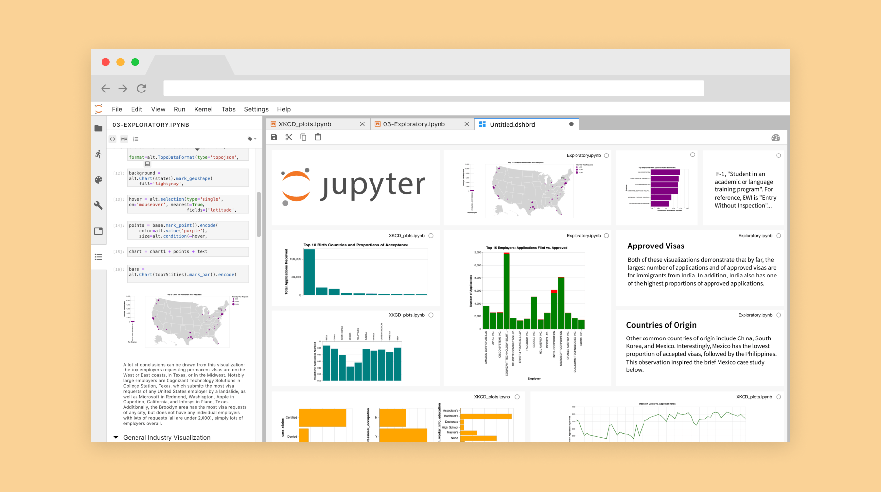
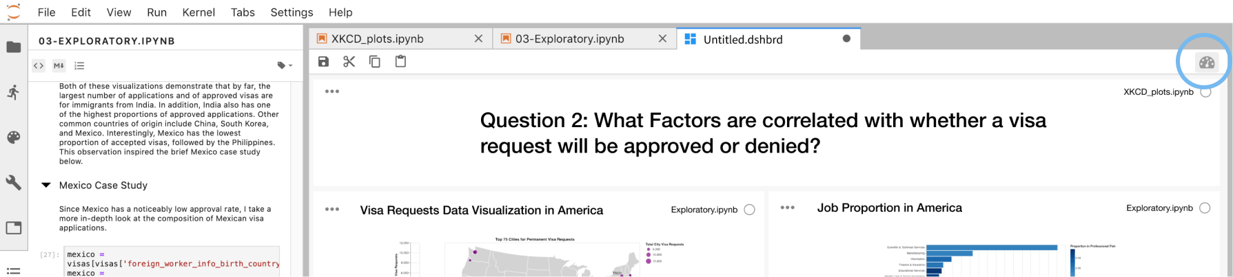
After consulting Zach Sailer (lead software engineer), I found that it would be feasible to create a new file type (.dshbrd) that could be connected to notebook widgets. This new dashboard file would contain metadata preserving dashboard layouts when saved.
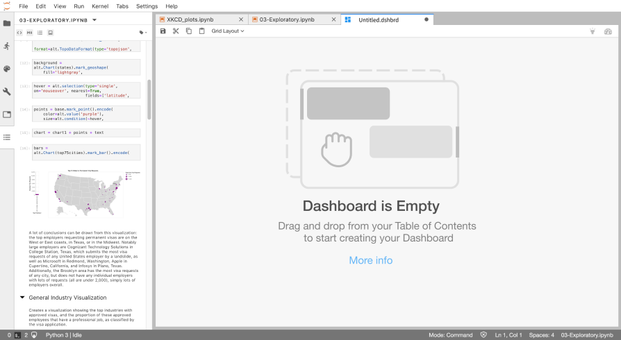
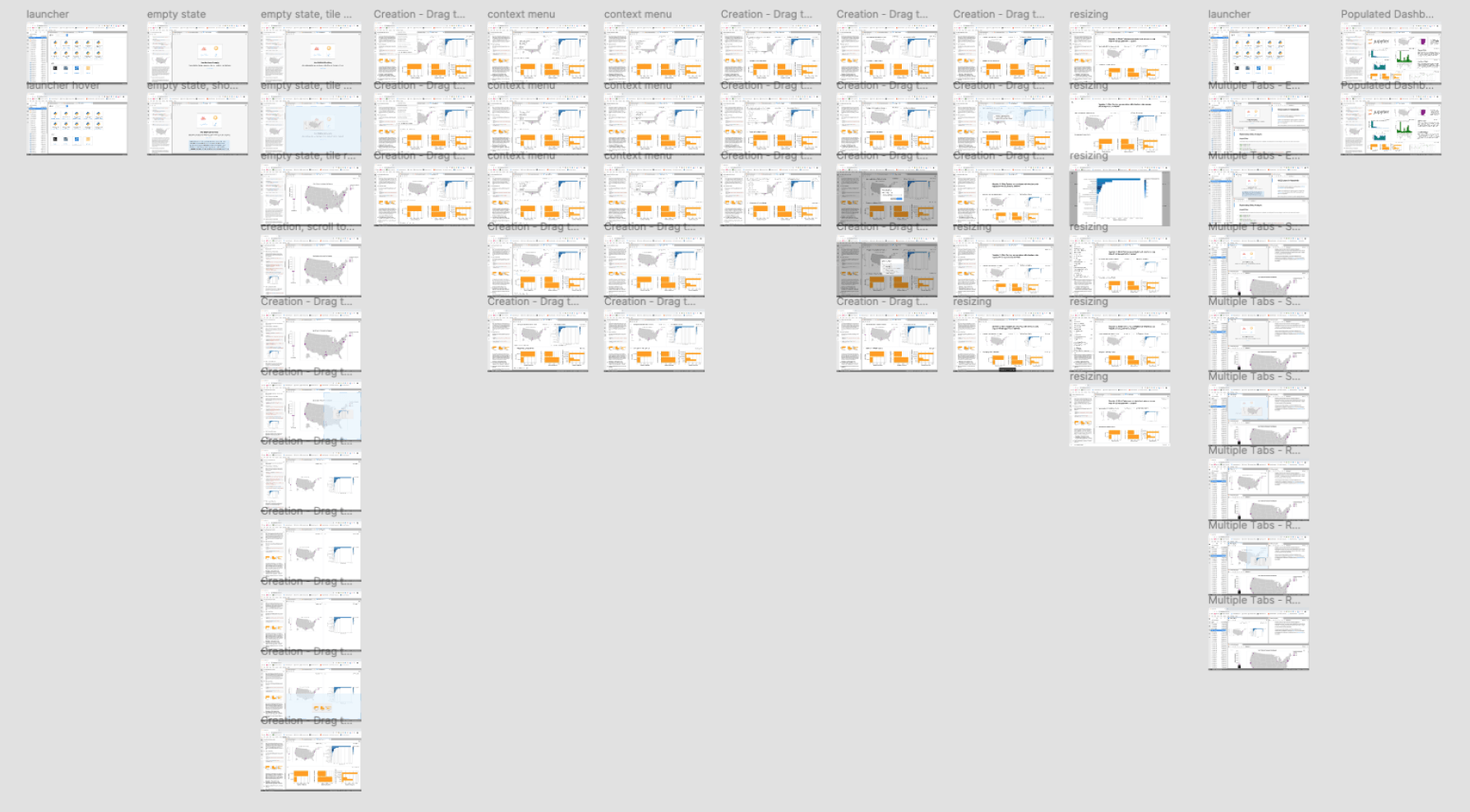
On launching the dashboard app in JupyterLab, an empty state prompts the user to begin the dashboard creation process. As we are introducing a new interaction style (drag and drop) not seen anywhere else in JupyterLab, training the user in this interaction is important to prevent workflow statis.
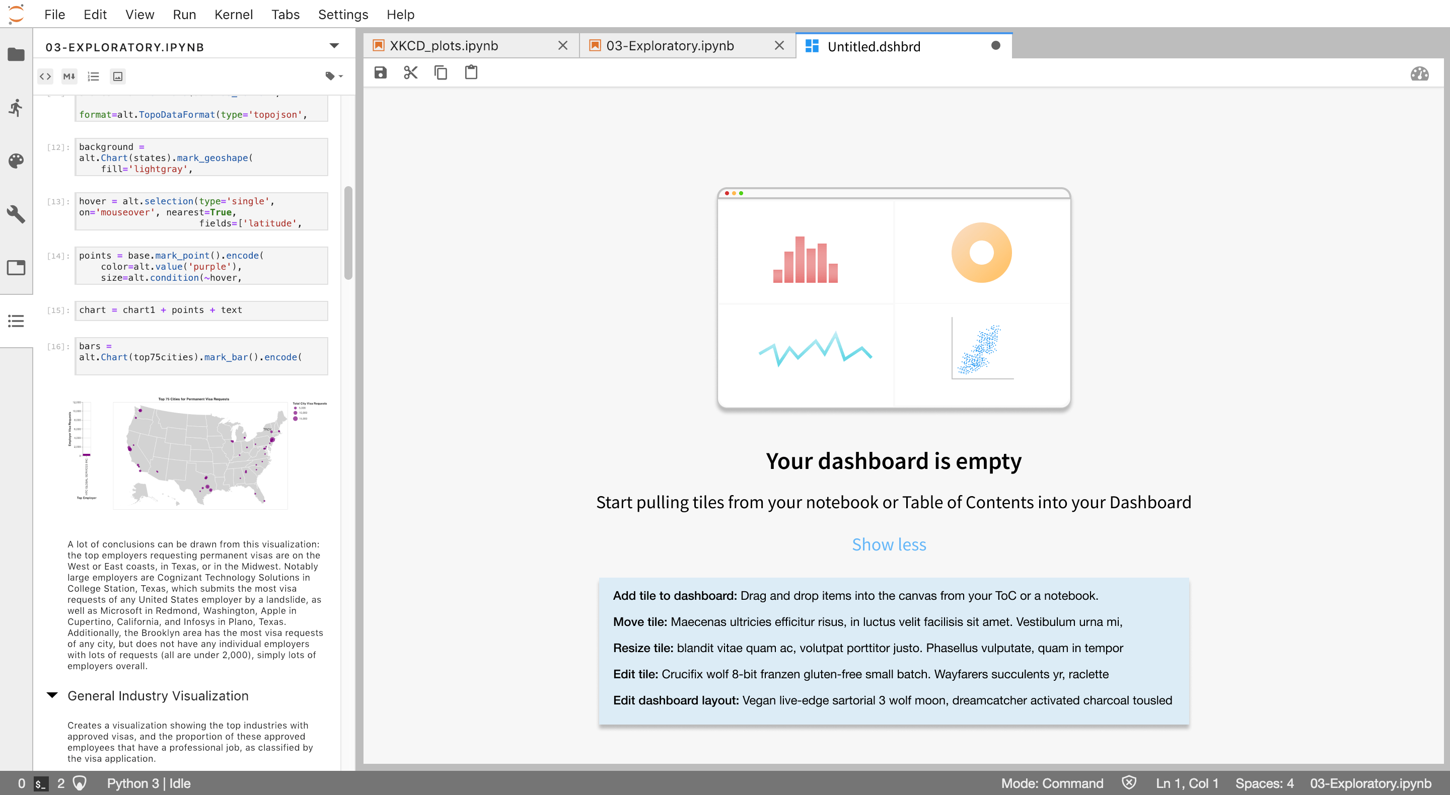
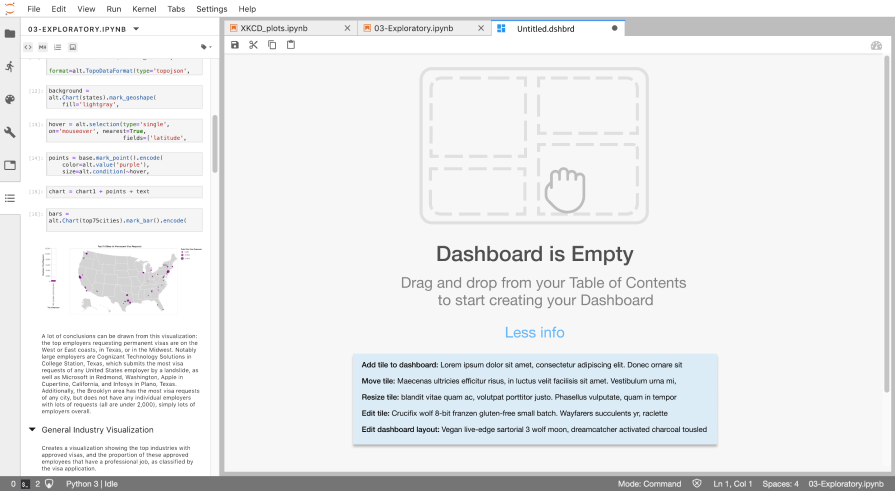
Users drag and drop pieces from open notebooks, or by dragging and dropping from the Table of Contents extension in the left sidebar. The Table of Contents (ToC) as a means for dashboard creation has several benefits:
When dragging and dropping notebook pieces into the dashboard canvas, docking and tab splitting follows phosphor.js drop zones and auto-resizing logic. The first piece fills the entire canvas, then the next fills up half (depending on where it's dropped, either horizontally or vertically), and so on.
Some design changes to the ToC were made for purposes of dashboarding:
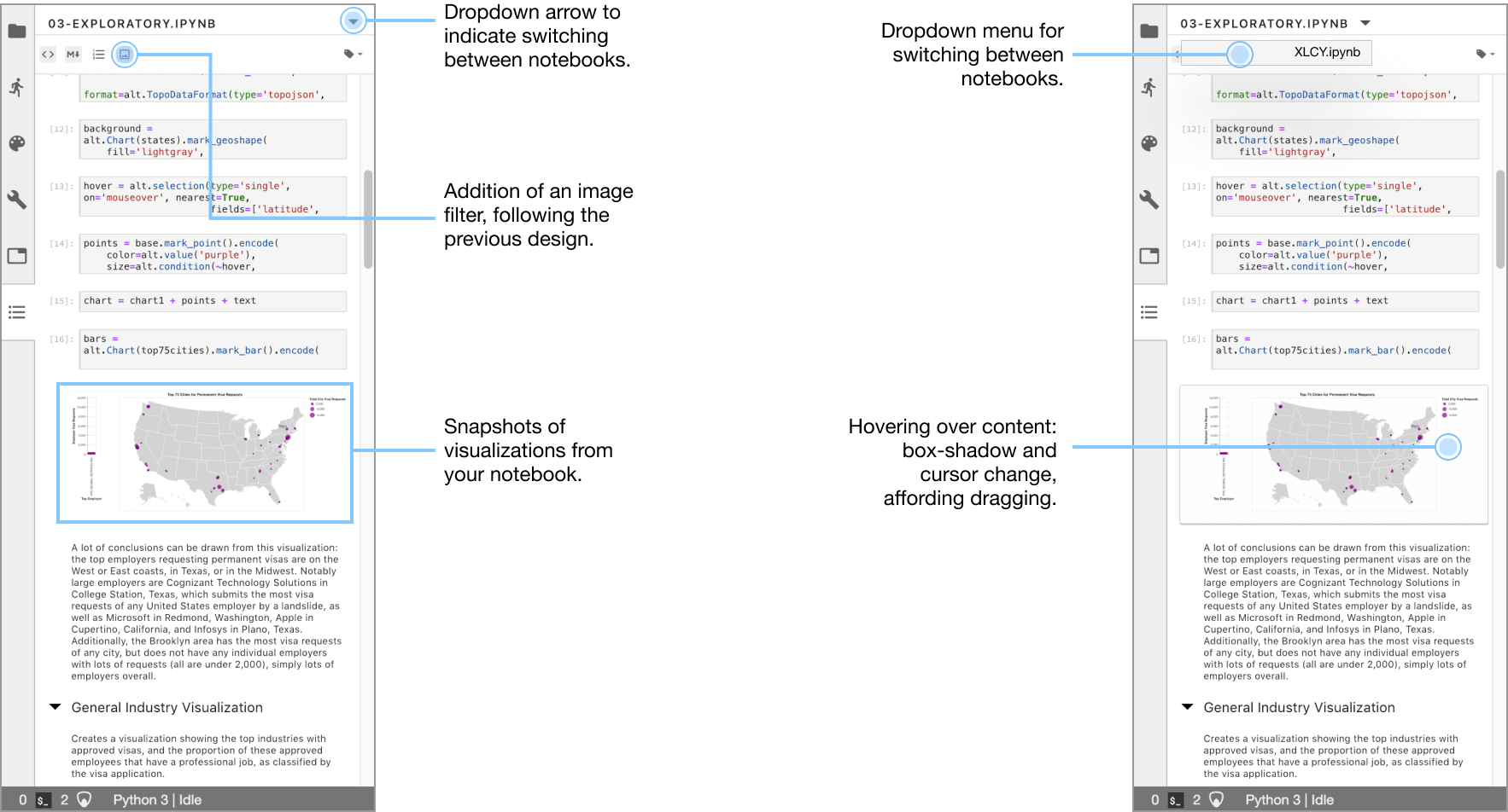
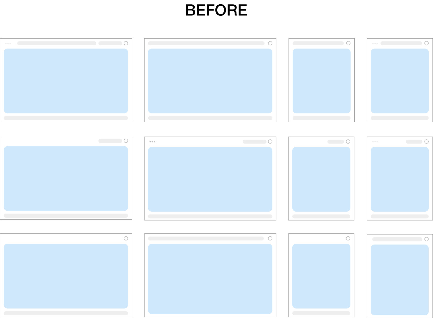
Tiles are widgets within your dashboard that represent pieces from your notebook. I experimented with low-fidelity layouts before iterating to higher-fidelity.
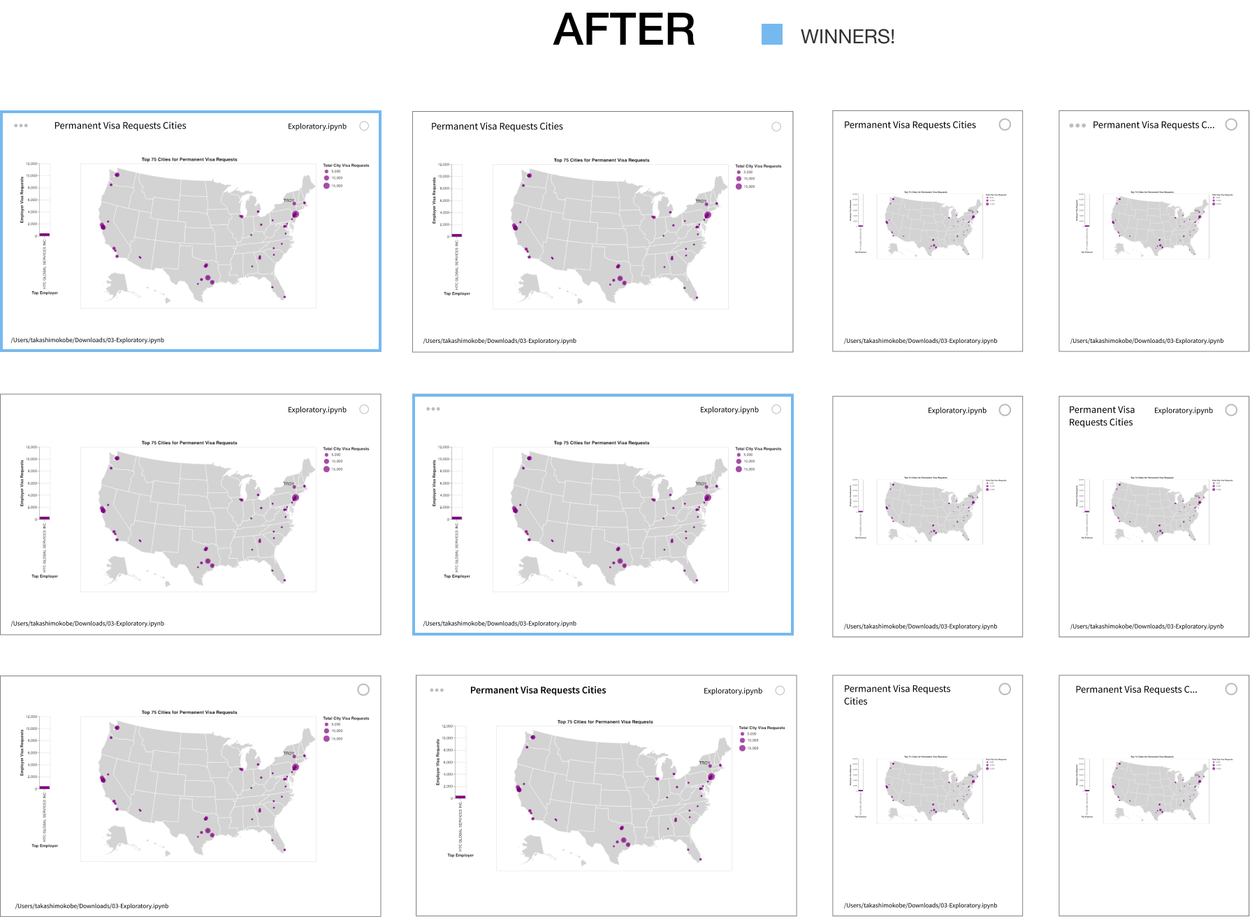
The final tile design consisted of four elements:
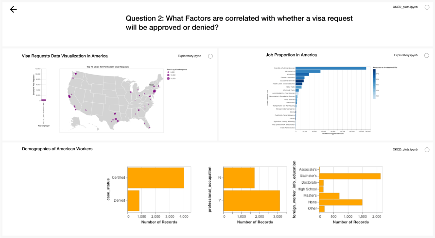
Dashboards are meant to be viewed and presented. The preview button in the toolbar strips away unnecessary UI elements for a presentable view of the dashboard.
Dashboards are connected to Notebooks, which are connected to kernels (what runs and checks the code). There needed to be a way to "package" all of these components together. After a discussion with software engineers, I decided to go with the .zip packaging route, where a .zip file is created containing the dashboard, notebook, and layout metadata for sharing.
After 3 rounds of iteration, feedback from the open-source community, my final deliverable was a working prototype of the user flow of creating a dashboard, editing and resizing dashboard tiles, packaging a dashboard, previewing a dashboard, and launching a dashboard.
06. Reflection
On finishing this project, I shared my work with engineering teams working on several initiatives, such as Voila, surrounding dashboarding and notebooks.