
Overview
As an intern at Project Jupyter, I worked on designing and releasing a status bar extension for JupyterLab that surfaces important changes in the system as they occur. Working closely with my team of developers, I helped ship the status bar on npm. The project has been downloaded +1 million times, and has been added to the core JupyterLab interface.
Role
UX Design Intern
Duration
March 2018 — June 2019
01. Background
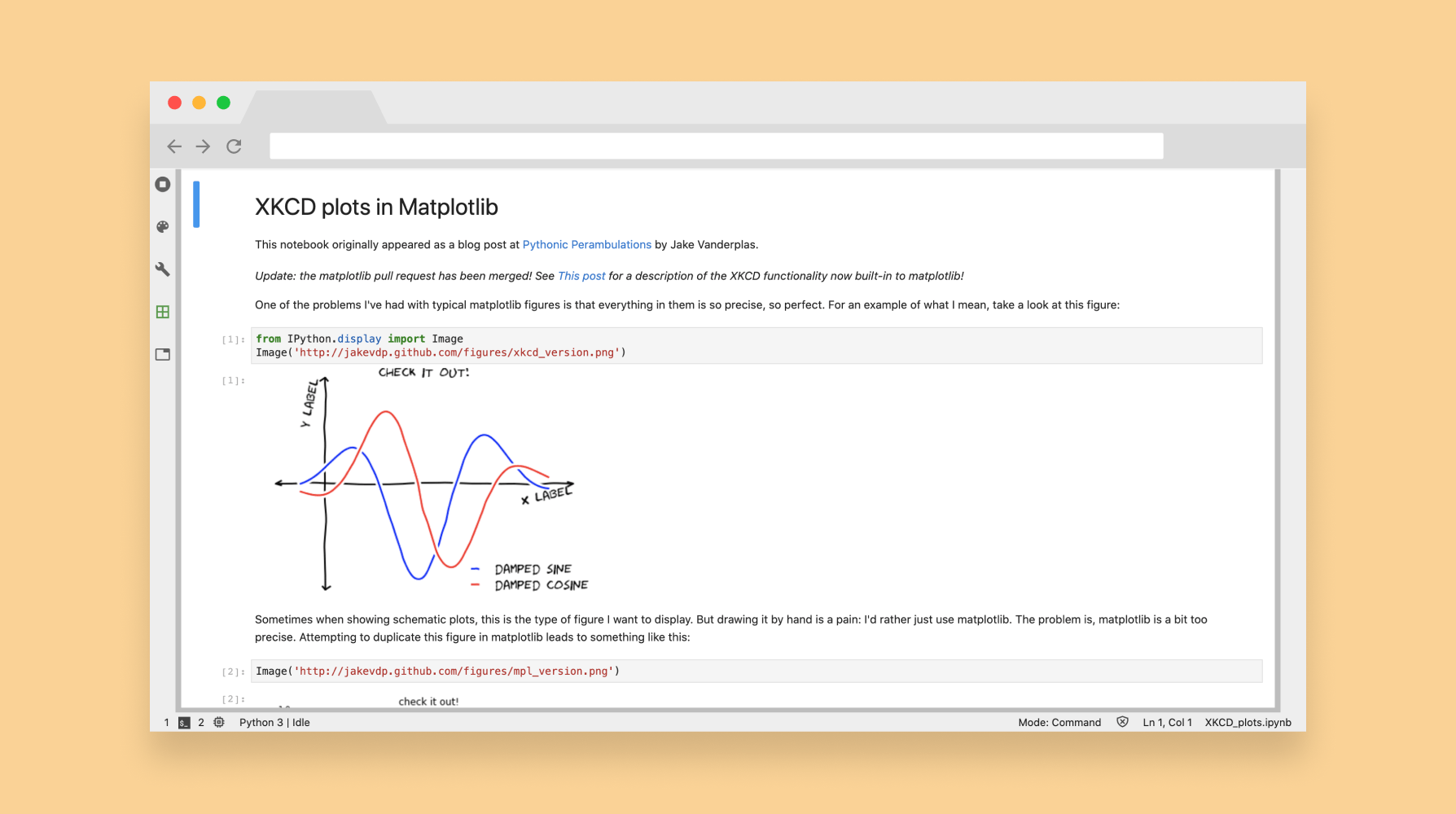
Project Jupyter is a set of open-source software tools whose goal is to drive data computing and scientific exploration. JupyterLab is Project Jupyter's flagship IDE that supports multiple programming languages, dynamic and static processes, and editing of text documents. Users can write, run, and present code all within the same interface.
While this might seem like magic, a lot is going on behind the scenes in JupyterLab to make everything work. The status bar surfaces important changes to the back-end when they occur.
02. Problem
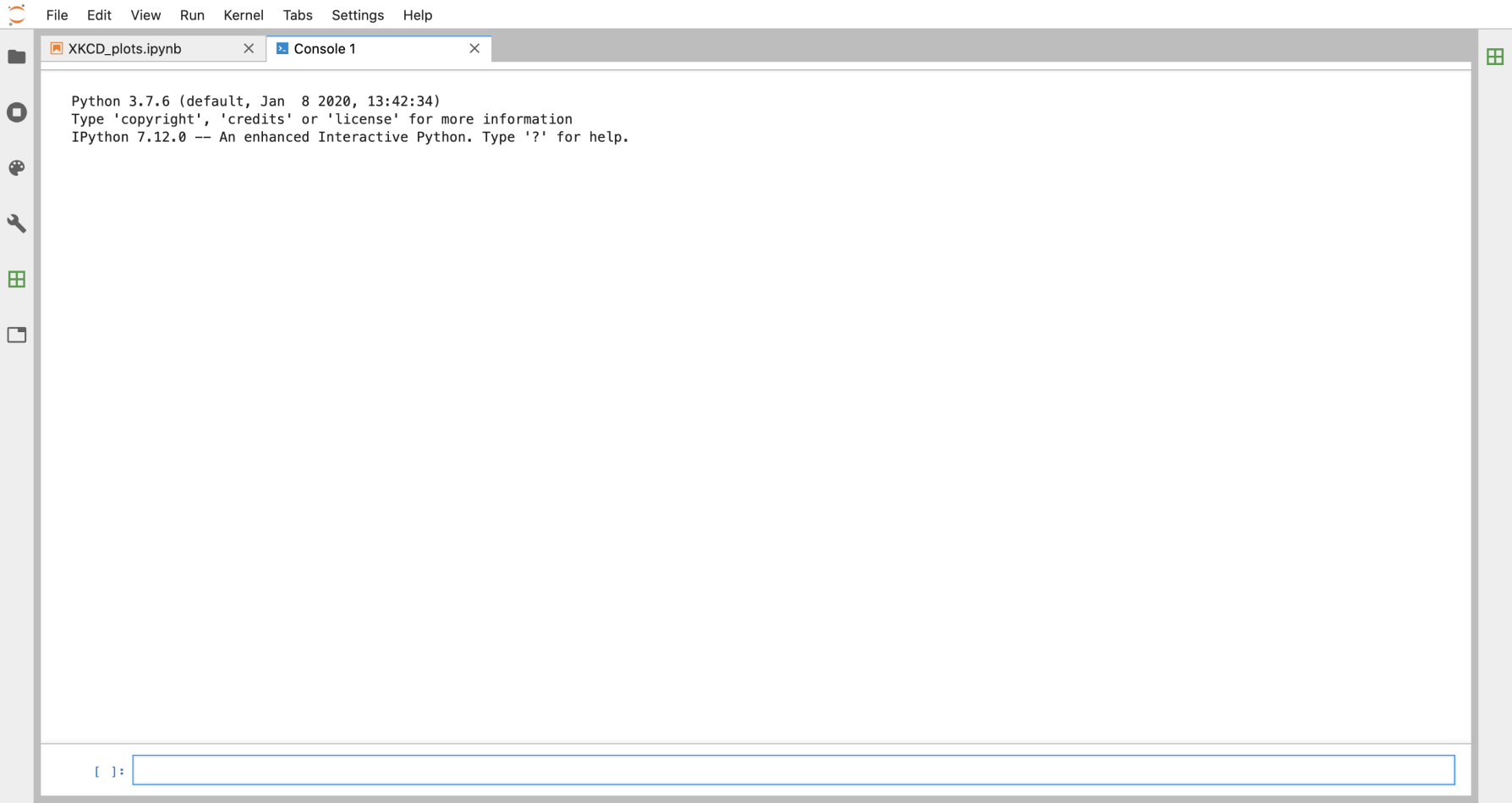
There is no way to monitor changes in certain states without using some third-party application, such as an activity monitor extension.
If something goes wrong in the back-end, trouble-shooting was difficult and involved intuition and guess-work to fix. Often-times, users would have to search within JupyterLab to surface problems.
After brainstorming potential design patterns as a means to surface these states, we decided to explore the status bar due to:
03. Research
I reached out to JupyterLab's open source community to understand pain-points and goals related to this idea of state. After 4 video calls, I audited Github issues to get an idea of the prevalence of issues raised in conversations. Key findings:
I developed empathy artifacts highlighting user motivations and frustrations after referencing other status bars from Visual Studio Code, Sublime Text, Eclipse, and Microsoft Word.
Job to be done
“I hire the status bar to streamline my workflow by allowing convenient access to important information about the software.”
User stories and job stories
“As a software engineer, I want to easily find which line and column I'm on so that I may debug my code.”
“As a data professional, I want to keep track of my memory usage without using a third party application so as to not disrupt my workflow.”
““When I am uploading a large dataset, I want to be able to see how long it will take, so that I may do other work if I have to wait.”
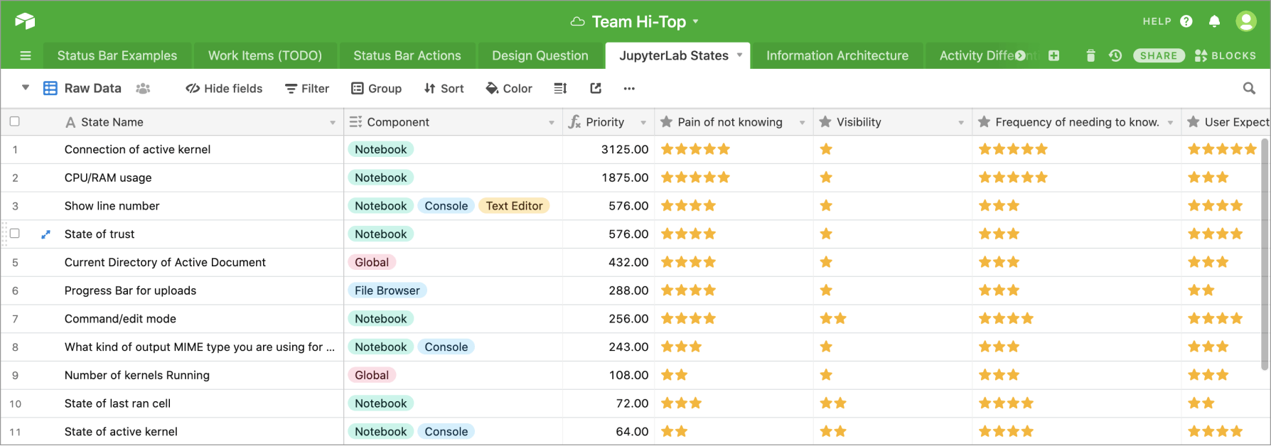
Working with subject matter experts, I went through JupyterLab and audited all representable states (39 total). We ranked each state based on criteria formed from user research:
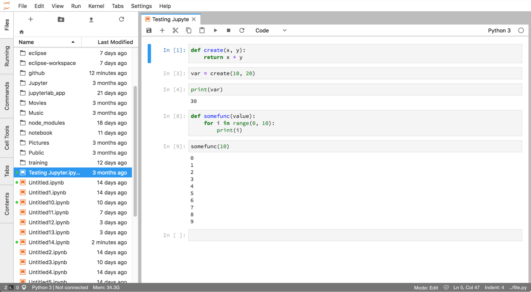
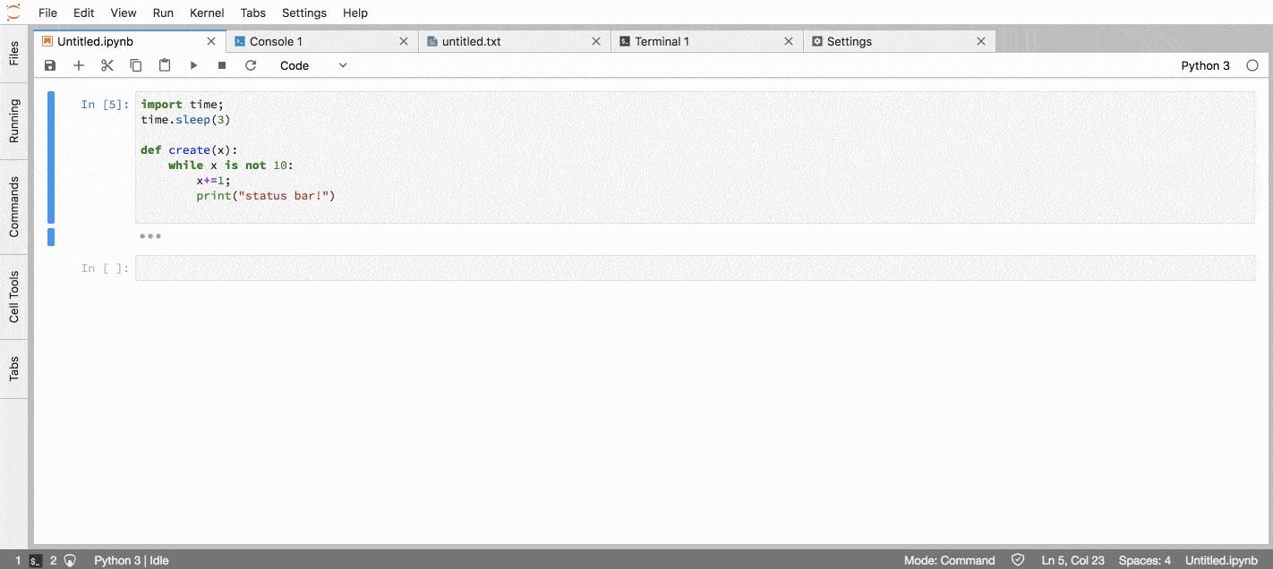
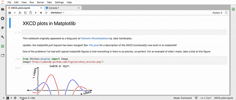
We then narrowed down the list to 10 states to be represented in the default status bar. Some of these included a monitor of kernel activity, and the current line and column number.
03. Constraints
Design for the status bar was a challenge due to its unique constraints.
05. Solutions
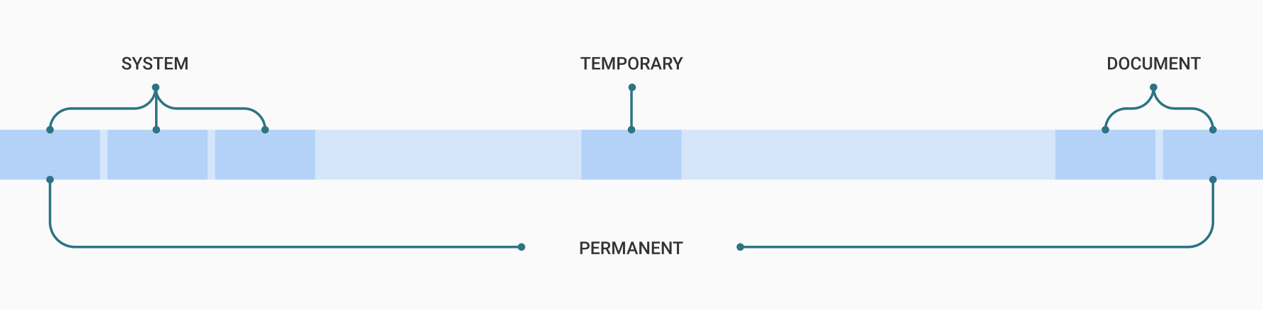
A well-defined information architecture provided a solution that handled context switching. For each of our 10 states, I assigned them organizational schemes and grouped similar items in AirTable (a spreadsheet tool for organizing qualitative and quantitative data). The schemes were: number of contexts, task, permanence, and system or document specific.
Based on the groups formed, some rules for information architecture were developed:
The left and right widgets of the status bar are global (never get dropped).
Widgets going towards the middle of the status bar get dropped more frequently. Temporary items, such as the progress bar, get placed in the middle.
Widgets with similar tasks get placed together.
System information is separate from document information.
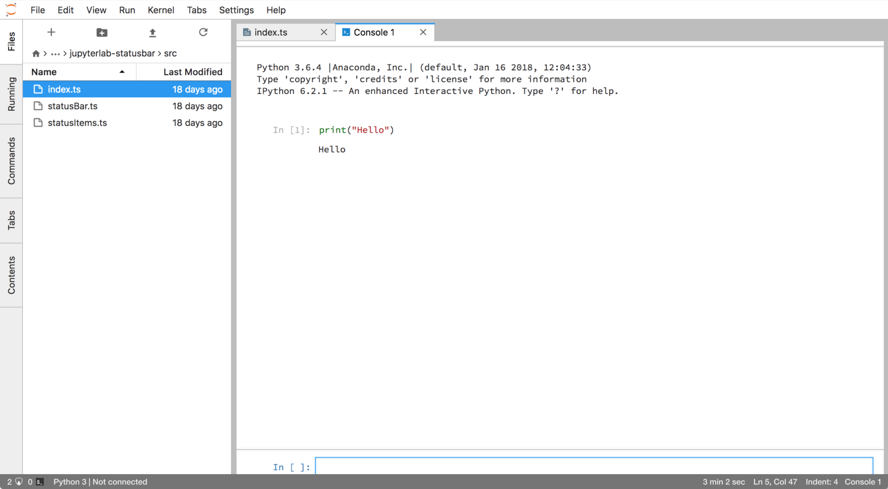
After sketching out states, user flows, and state changes on paper, I went into Figma and wireframed status bars in different contexts of JupyterLab. For each widget, I focused on designing the minimal amount needed to accurately represent that state. After wireframing the status bar in different contexts, I brought designs together in a prototype that simulates a typical user workflow as they change contexts within JupyterLab.
Minimizing real-estate usage
I used icons whenever possible to represent widgets due to their 1) their ability to convey summarized information at a glance and 2) small size.
Designing interactions
Actions that were previously embedded deep within JupyterLab were made more accessible using the status bar. Users can change syntax highlighting and jump to line and column number without having to search within menus.
Hover states on widgets provide further clarity into what information the widgets represent and what actions you can do with them.
4 rounds of think-aloud user testing revealed that wording was confusing on some widgets (e.g. Tab vs. Indent), and that iconography for the kernel widget was too detailed and confusing. I iterated and did 1 more round of testing before reaching saturation on user feedback.
More detailed user testing at JupyterCon 2018 revealed that some users did not even notice the status bar. Users that did notice and use the status bar to complete their tasks, however, had a task completion rate of 96.4%.
06. Reflection
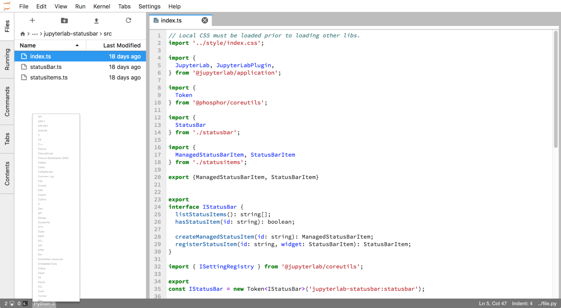
By being involved in the full product cycle, I helped launch the status bar as an extension to JupyterLab via npm. Different components render based on the active context, and the status bar is customizable via external APIs to account for various workflows.
Currently, the status has over 1.1 million downloads on npm. It has been added to the core JupyterLab interface.